One evening in the fall of 1940, at the peak of the German blitzkrieg in Britain, Henry Moore took cover during an air raid in the Belsize Park underground station in London. There he encountered dozens of others who had also scurried belowground to seek shelter from death and destruction; he became “fascinated by the sight of people camping out deep underground,” according to the Tate museum’s website. On returning to his studio he made some drawings from memory, and when art historian Kenneth Clark, chair of the War Artists Advisory Committee, saw the pictures he commissioned more drawings and appointed Moore as official war artist.
The drawings, a choice selection of which can be seen here, show people sleeping in rows, huddled together, sitting on benches, and sometimes with a mysterious corona of light arcing overhead and pulling them all together. Moore described these crowds as “the most pathetic, sordid & disheartening sight,” and yet he made dozens of sketches and the works have, in the years since World War II, come to be seen as emblematic of the stoicism and courage of the British people during the darkest days of the war.
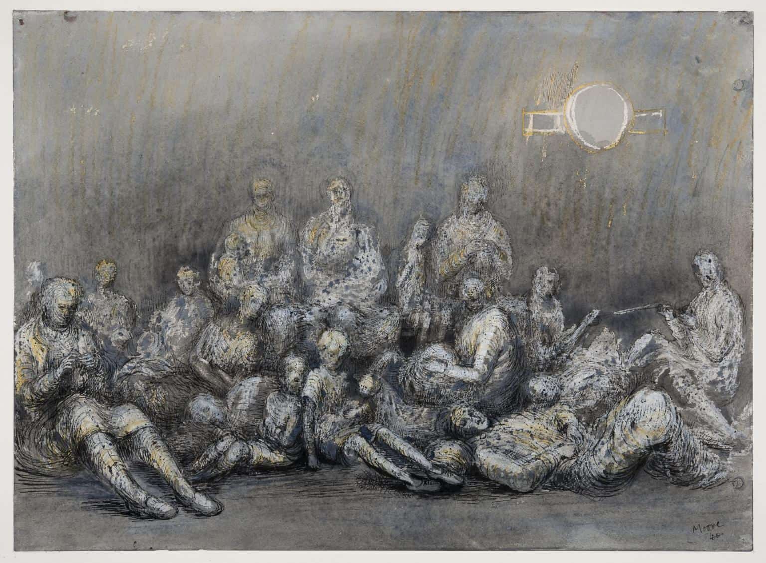
Henry Moore, Grey Tube Shelter, 1940
We do not yet—as far as I know—have artworks documenting the ravages of Covid19, but more than one older friend has reminded me about living through the worst days of WWII: “We survived the blitz, we’ll survive this.” And no doubt with most artists confined now to home and studio, drawing will be an ever more attractive option (especially with shows of larger works getting canceled all over the place).
Significantly, the first three artists here are using technology (iPhones and computers) to expand the definition of drawing. From Old Masterly renderings of objects to compositions that push the boundaries of abstraction, this work is arresting and forward-looking, suggesting that there are still more frontiers for artists to explore. Provided we all follow the words of the poster plastered all over Britain in 1939: “Keep calm and carry on.”
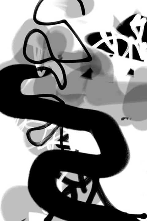
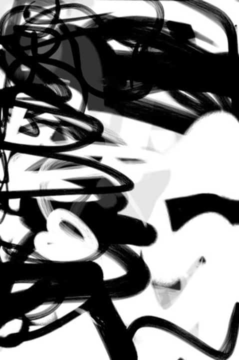
Phillis Ideal: After downloading an app known as Zen Brush and using one finger on a tiny iPhone, I created a series of drawings while riding the subway. The range of effects amazed me—from snaking lines that look like they should have been made with a sweep of the arm to subtle tones that range from pale gray to the blackest black. Even on the small screen I could reference the gestural paintings of the founding fathers of abstraction as well as the contemporary idioms of cartoons and graffiti.
These drawings depend for impact on a certain measure of spontaneity, which is preserved by going directly from the small screen to a larger size with no editing in between. The iPhone images are one of a kind and are printed on a 20- by 30-inch format with light-fast inks on archival paper.
I was drawn to pursuing this project because even using the up-to-the minute tools, the prints still show the unmistakable evidence of the hand—a quality that connects them with the timeless efforts of capturing the human experience.
“iPhone Print Series 2,”: Black and White #3 (2016), light-fast inks on archival paper, 30 by 20 inches (framed)
“iPhone Print Series 2,” Black and White #9 (2016), light-fast inks on archival paper, 30 by 20 inches (unframed)
Abraham Elterman: Drawing for me is a form of experimentation, a way of working out visual and spatial ideas. In the past I have used traditional methods and materials—such as charcoal and graphite—but lately I’ve been drawing mostly on my iPad, which allows more freedom than traditional methods. For example, I’ve found it intriguing to draw electronically on dark backgrounds—which is akin to drawing with light—as it produces luminous results in which the eye seems to want to fill in any visual gaps, completing the picture in some mysterious way, by “seeing” things that are not really there.
The images in these digital drawings, though they have not yet been printed, are unlike those in most of my other work, which tends to be abstract and expressionistic. However, they seem to be similar in spirit, in that they try to convey what I think to be the common denominator in my work, a preoccupation with frailty and human vulnerability.
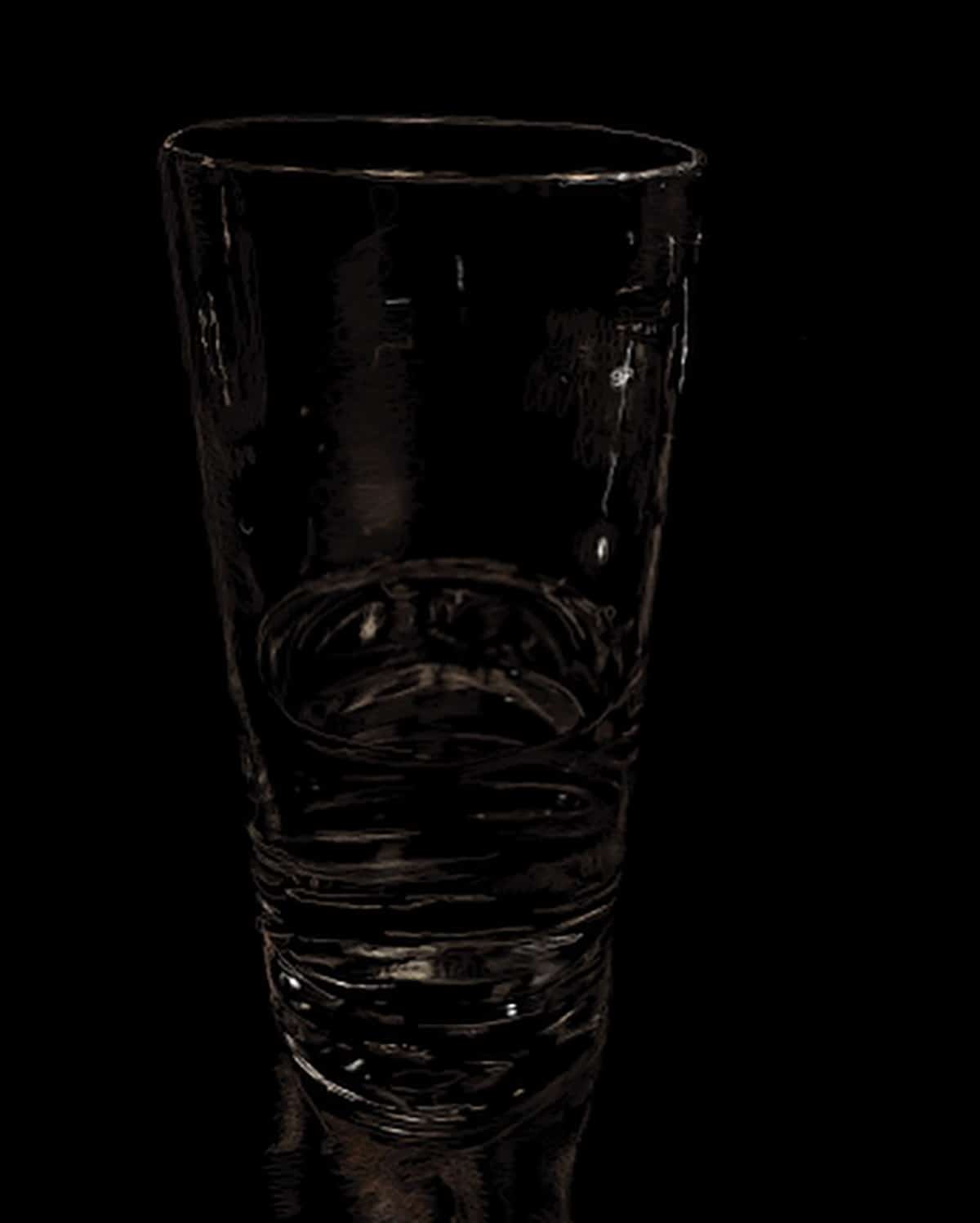
Abraham Elterman, Glass of Water
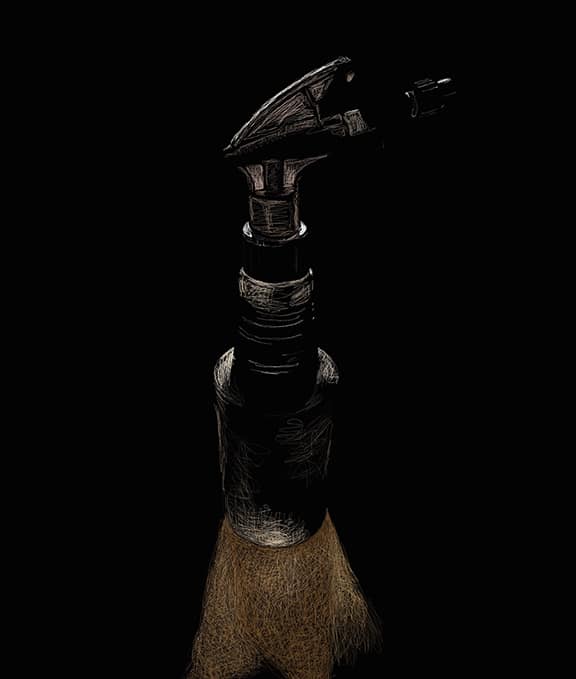
Abraham Elterman, Spray Bottle
Jonathan Morse: I came to drawing through the back door of photography; really, for me, its essence is mark making. Marks create a kinship with generations past all the way back to cave painters, each acting out this inherently human endeavor. My current and recent work explores the interaction of analog and digital marks and their interface with organic forms such as trees and flowers.
Through this swirling together of related and unrelated imagery, I find myself choreographing the ongoing dance between our human selves and our digital partners as we become increasingly and willingly cyborg—marching joyfully, and sometimes fearfully, into an AI future we cannot fully perceive. Even marks created digitally help plant the flag of our souls on the trembling soil, the shifting sand, of our present and uncertain planet. I admit that to do my artwork I willingly embrace and take the hand of my photoshopped avatar, who guides me through the digital divide, where together we walk into the collective experience of this new decade.
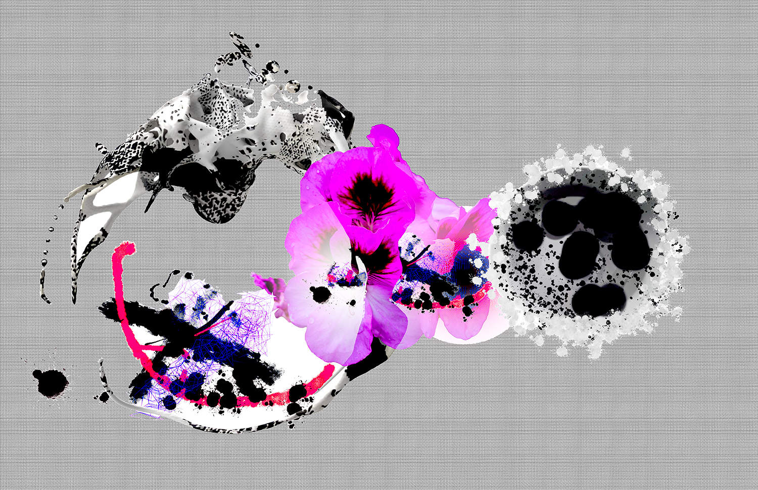
Anomalies 5 (2020), pigment print on Moab Juniper rag, 24 by 36 inches (limited edition of 5)
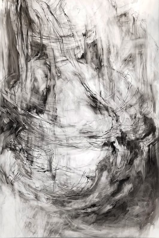
Christine Bourdette: I love drawing for its immediacy and fluidity. You can go from minimal gesture to maximal image within the space of a sheet of paper, with as many, or as few, mediums as can be found that will make a mark. The paper, or whatever the ground, offers a finite space within which an infinity of determinations can be laid down, and I am intrigued with how the drawing can be placed within the space available, with how, where, and why it interacts with the edges of its available territory.
As a sculptor, I have always appreciated drawing’s freedom from the law of gravity as well as its spontaneity: it can often express an idea without necessarily dwelling in the realm of “object.” Additionally, I have always loved the versatility of paper—all kinds—as a medium to be drawn on, or manipulated sculpturally, or simply for its utilitarian capabilities and its long history of charting ideas.
Stagger (2017); graphite, Flashe, pastel, and colored pencil on paper, 22 by 30 inches (photo: Gene Faulkner)
Intrusion (2019) pastel, colored pencil, silver sumi ink, and graphite on paper, 22 by 30 inches (photo: Jeff Lee)
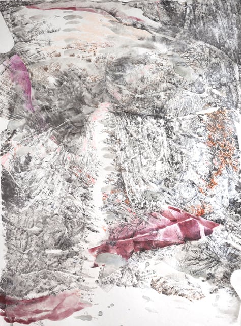
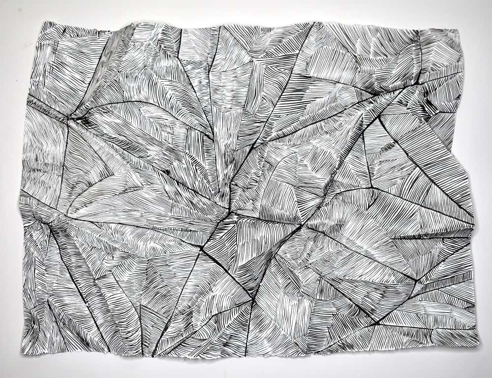
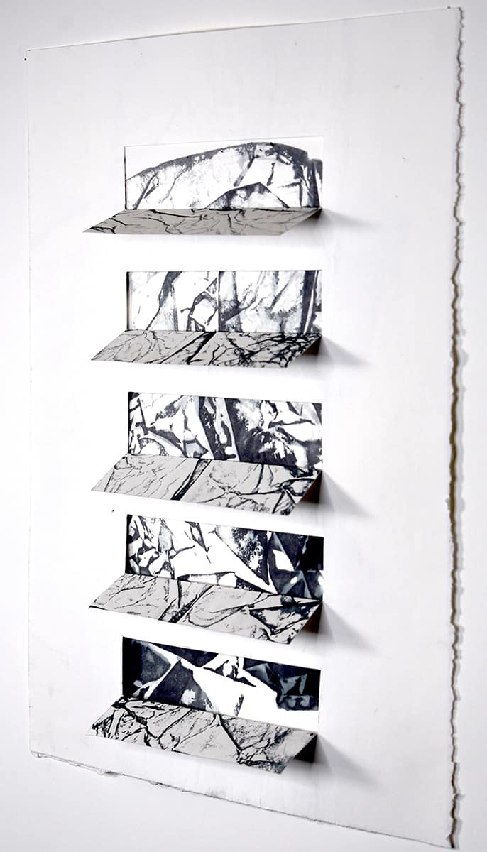
Iain Machell: Drawing for me is a very primal activity that allows ideas to accumulate and flow, and often break free of a flat surface to venture into three-dimensional space. All of my creative interests can be pursued through drawing, and they can range from observational drawing from nature to texture and media experiments, from controlled actions to uncontrolled experiments. At times the studio resembles the mad scientist’s laboratory, and often I never know what components, media, and scale will work the best until they are mashed together.
Interrupted is a series of new drawings based on nature, and rock formations in particular. Each drawing breaks free from the surface to explore three-dimensional space in some way, and each incorporates a visual intervention such as a grid or geometric shape or line. Interrupted 28 uses a dye-transfer process, which captures the unpredictable colors leaching from commercial papers when soaked and pressed. The resulting shapes, lines, and textures resemble rock structures and cliffs, or fossils trapped in rock. Boxing them in windows in the drawing adds an element of the unexpected, perhaps an attempt to dominate, measure, or interfere with nature.
Interruption 2 (2019), ink on shaped paper, 22 by 30 by 3 inches
Interrupted 28 (2020), dye transfer on cut paper, 15 by 11 inches
Anna Patalano: Drawing started for me not as drawing but as learning to write perfect cursive handwriting on a blackboard in elementary school. I was so good at it that the nuns kept me out of recess to teach other kids how to do it: elegant ellipses, straight diagonal lines, curves of all sizes shaped in chalk on a board lined with horizontal demarcations for upper- and lower-case letters. I was fascinated and quickly understood that I could interpret what I “saw” with line. So, I copied old master drawings out of library books and moved into drawing in sketchbooks of things that were around me. Ultimately, I learned how to articulate form through drawing as the most direct means to document perceptual observation. Through the many years in my practice and as a teacher, what drawing really has become is a way to figure out my vision…both outside of myself and within my own mind. Drawing is thinking and seeing. Drawing is cataloging visual notes. Drawing is making marks to mark time, experience, and space. Drawing is the backbone of not just the visual arts but of creative thinking in many forms of media. Drawing is an exquisite marriage of meditation, freedom of thought, and physical acuity. Drawing is essential.
Erratic E (2020), ebony pencil on paper, 9.5 by 10 inches

Pear Core (2018), India Ink on paper, 24 by 36 inches
Jan Anders Nelson: I am not typically an artist who works figuratively, or at least that is my perception. In reviewing all of the photography, drawing and painting that I’ve created over the decades, I find that the vast majority are devoid of people, but arenonetheless narratives about their lives in one form or another. And yet, as I look at the drawings I make, there are moments in my life that are highly personal stories,
The Winelist is from a candid photograph taken while my friend and mentor, Don Eddy, and I were out for dinner in New York a while back. As the title suggests, Don is looking at the wine list, that moment capturing so much for me about the nature of our relationship and some of the things we both value, like fine dining, a great wine, talking about our work and lives and those of our loved ones. The catalyst for drawing this image was a request from poet and artist Didi Menendez to a number of us who are members of a little “tribe” that has grown out of her work as a publicist for a magazine called Poets & Artists, which for me has been an interesting adventure in meeting a fresh set of artists, most of them online.
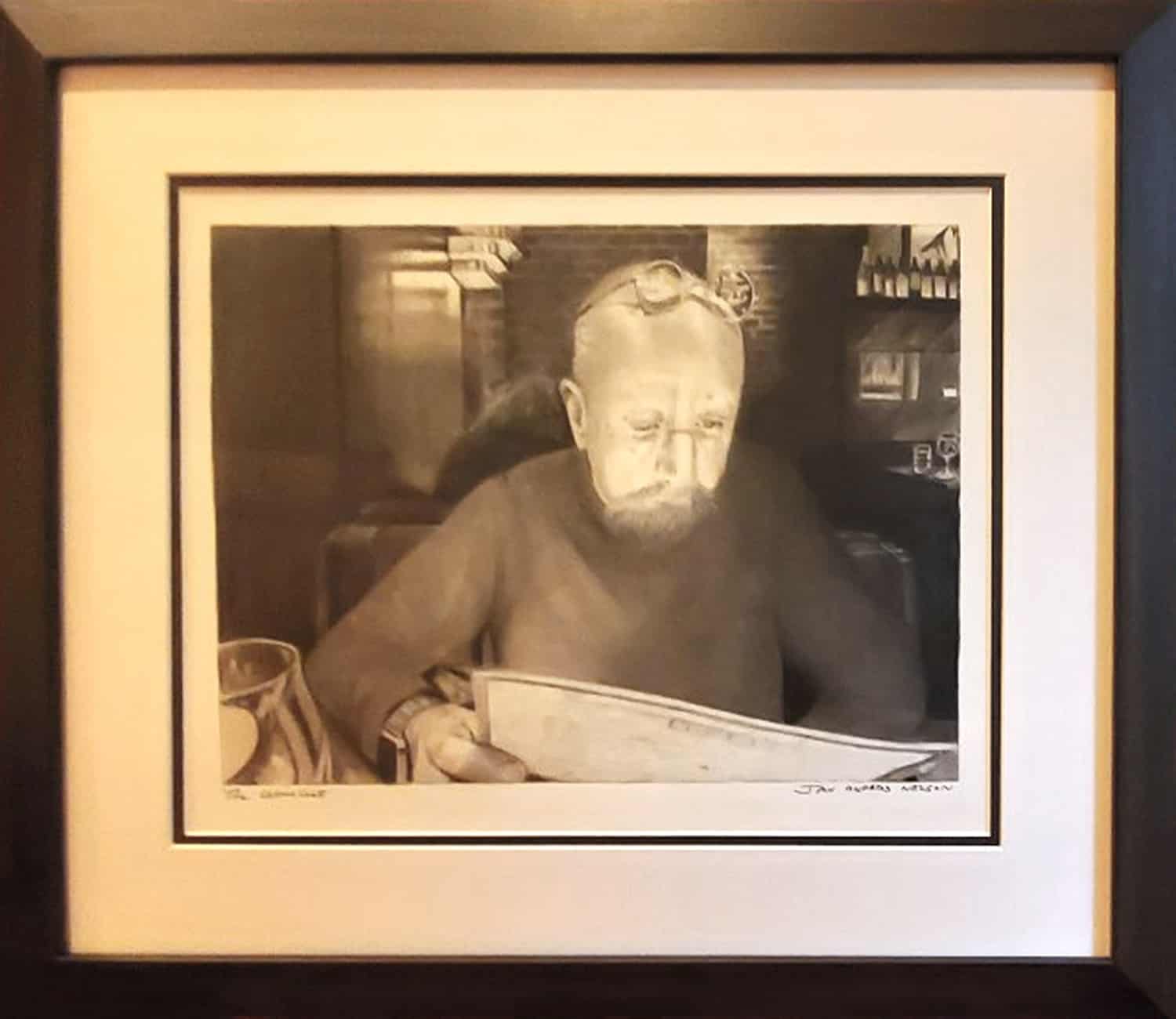
The Winelist (2020), Polychromos pencil on Strathmore 500 Bristol, 10.5 by 14 inches (image size)
Bonny Leibowitz: I love a beautiful, sensitive, nuanced line. The allure, for me, is how it varies in weight, the way it turns, breaks up and comes back—it’s the caress between the line and the space it inhabits.
Sometimes, I just can’t wait to get my hands on some drawing materials for a spontaneous, dynamic, squishy experience, as in Unraveling, where I used ArtGraf on Yupo paper. It’s a water-soluble graphite which I layer and move around with damp towels and a variety of erasers. The additive-subtractive process works really well with these materials.
In Impermanence Now, I used monotypes containing a lot of line work and ink on Masa paper, which I then cut into shapes and combined to make a large dimensional work—a drawing in space.
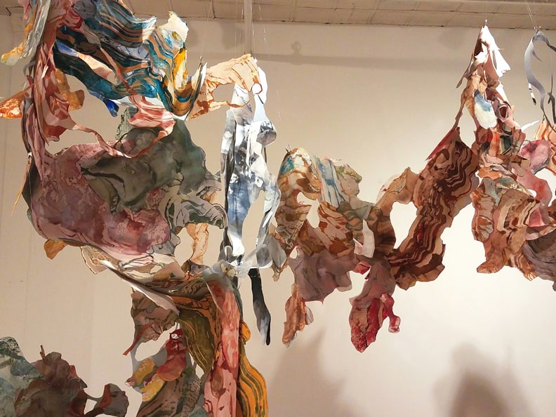
Impermanence Now, wax, pigment, and ink on Masa paper, size variable
Unraveling (2019), Artgraf on Yupo, 40 by 26 inches
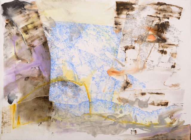
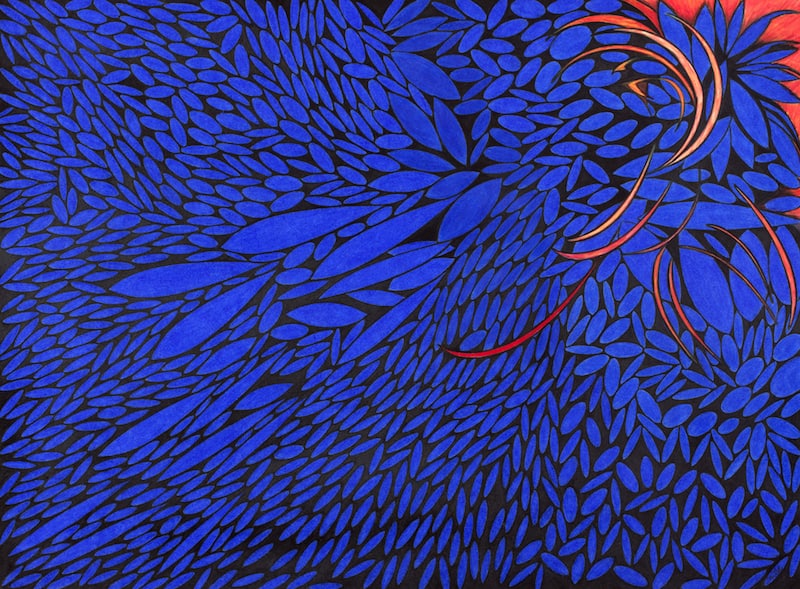
Bill Santelli: One of the most amazing things about nature is how personal it is—how much it can fire up the individual imagination and function as a metaphor for growth and change. My series of drawings “The Path” seems to depict, at the most basic level, sea grasses. Yet they’re also highly abstracted, brightly colored environments. I think of the narrow tapered shapes as forming a site of contemplation for the inner self, a kind of locus of discovery.
Each drawing is a slightly different study in composition and color. These are realized on large sheets of Stonehenge paper, and the process is very labor intensive. Each drawing takes about three months to complete, and I use up dozens of Prismacolor pencils, building up multiple layers of color to achieve intensity and rich tonality. At a distance their surfaces appear unified, but move up close and you can see that they’re really composed of many small marks that merge into a smooth sheen. I use bold colors for their power to evoke sensations and elicit an emotional response from the viewer.
Mindstream 1 (2019), Prismacolor pencil on paper, 30 by 22 inches
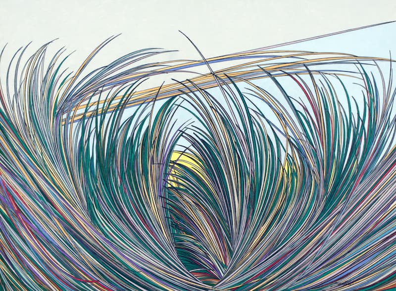
The Path (2018), Prismacolor pencils on paper, 22 by 30 inches
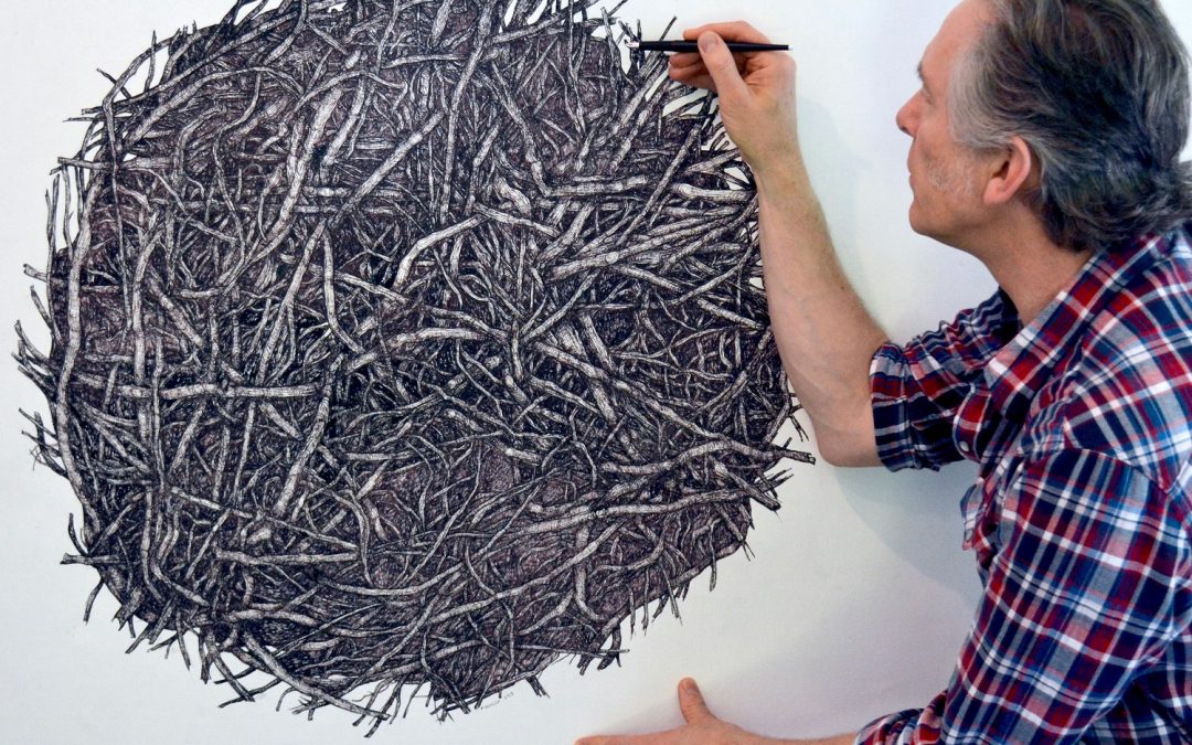
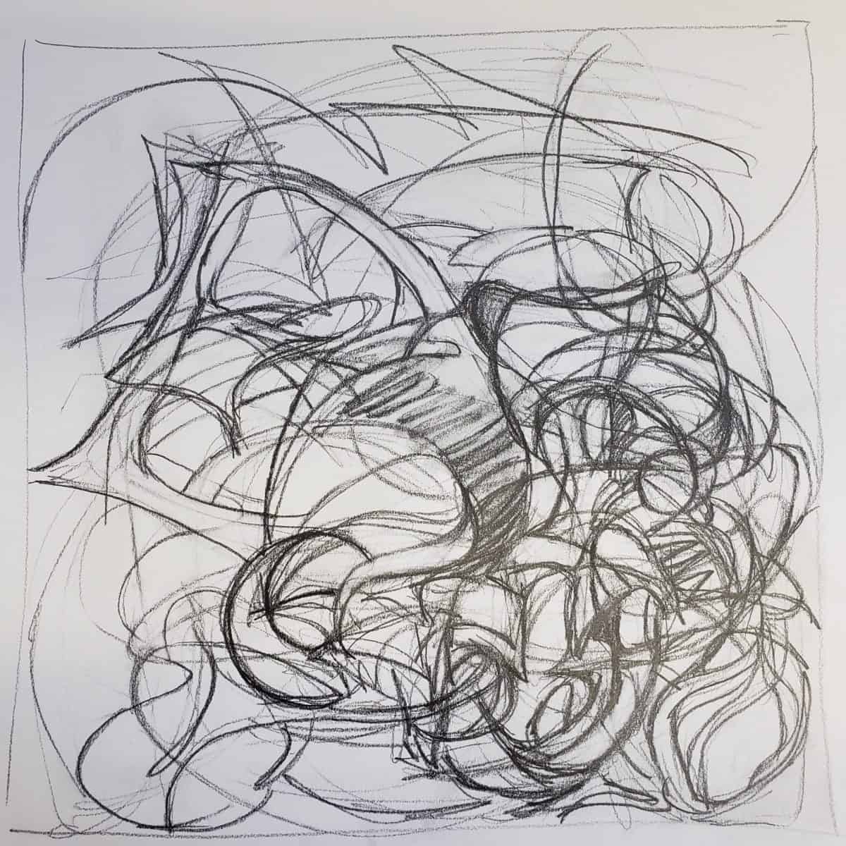
Top: Iain Machell at work on Root Ball 2 (ink on canvas)
so glad to see all this work, to your (Ann) commitment to drawing –