After eight posts about drawings, it’s challenging to come up anything new to say about the medium, but if the materials remain largely the same, the circumstances for artists everywhere have changed dramatically in the last year. Many of the members included here mentioned the ways in which the pandemic changed their attitudes, subject matter, and studio practice. As Elaine Forrest noted, in a time of constant long-term stress, the repetition of fine ink lines in her drawing proved soothing. Samantha Palmeri turned to a group of unresolved drawings and discovered that working on top of older efforts, “beautifying the ugly, you might even say, is a perfect metaphor for emotionally navigating through the pandemic.” Most of the artists here work in abstract idioms, but William Norton’s powerful mixed-media, quasi-figurative works are a direct response to another phenomenon of our times—the hideous brutality of the police force toward people of color. As social protest or therapeutic refuge, these works are reminders that the power of drawing endures since the first cavemen (and possibly women) made images by torchlight many, many millennia ago.
Ellen Weider: Drawing and painting are of equal weight in my work. Sketchbook and Cubism both reference art and the practice of art, in work where drawing and painting coalesce. Sketchbook is a grid-format composition in which each unit of the grid can be interpreted as representing a page in an artist’s sketchbook with a drawing on it. Alternatively, the units can be seen as individual rooms: artists’ studios containing artwork or exhibition spaces displaying it. Cubism refers to the artistic movement started by Pablo Picasso and Georges Braque. The title of the work makes a humorous nod to that movement with a composition of cubes floating in space, contained within a boxy staircase-like parameter.
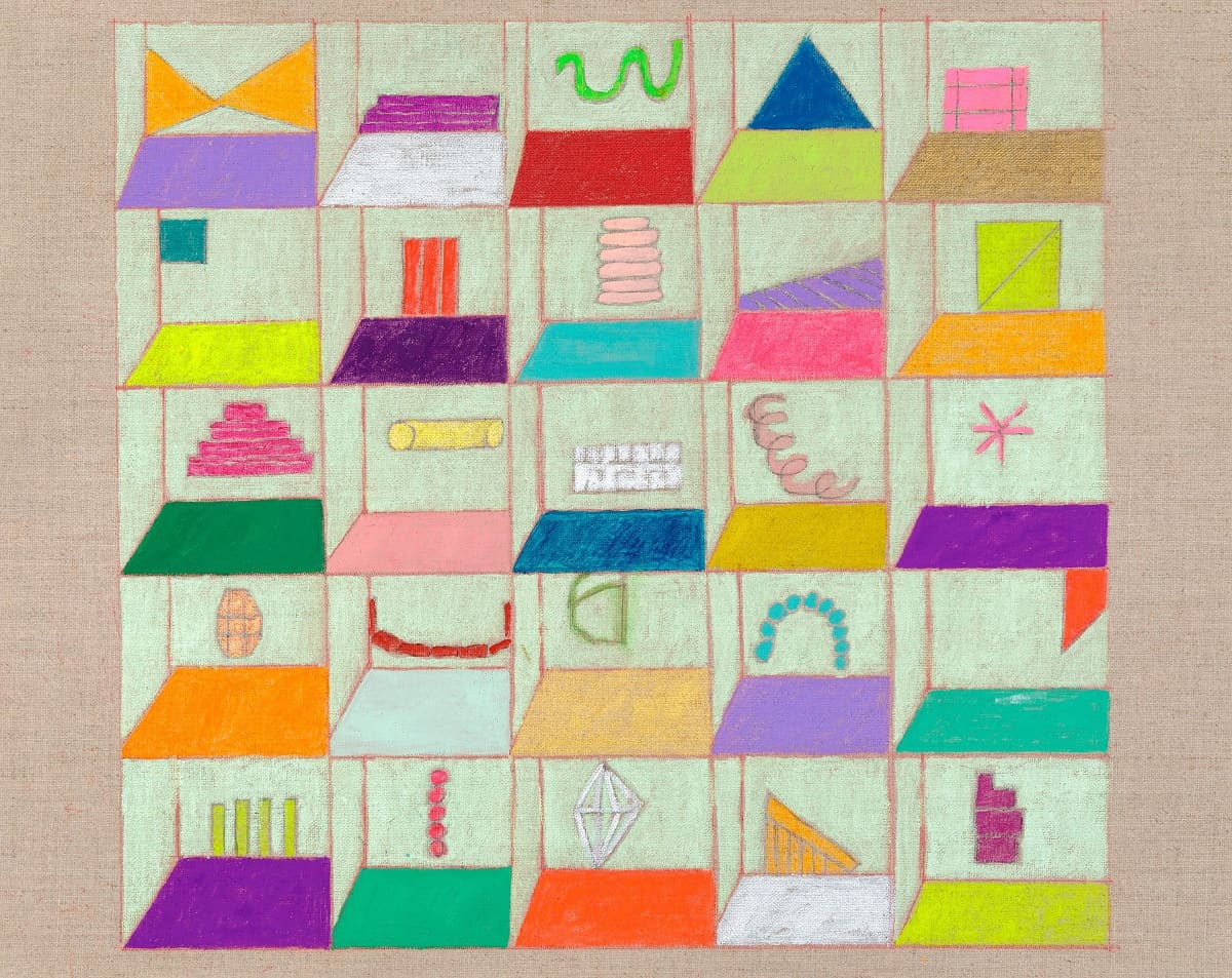
Sketchbook (2019), gouache, acrylic, and graphite on linen, 16 by 20 inches
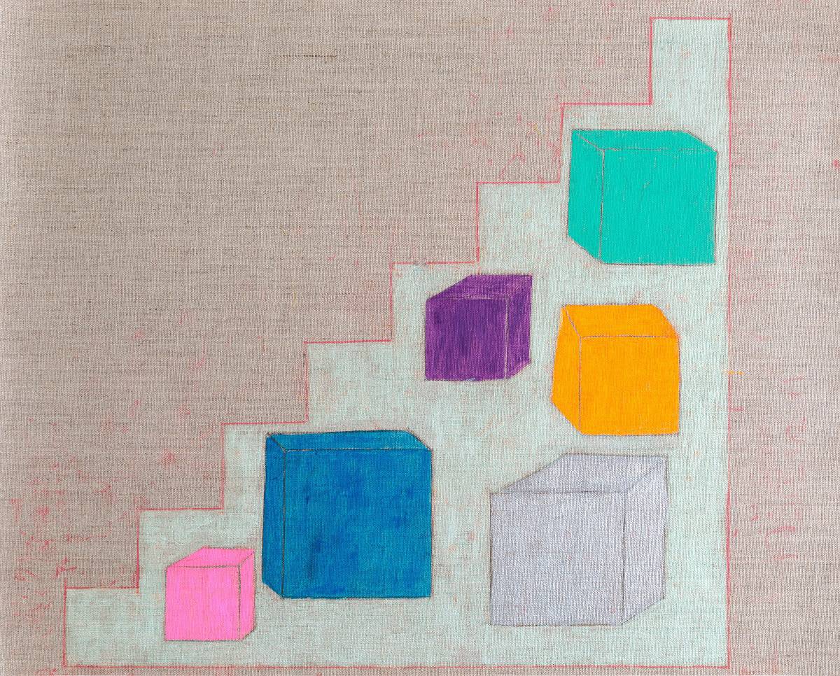
Cubism (2020), gouache, acrylic, and graphite on linen, 16 inches by 20 inches
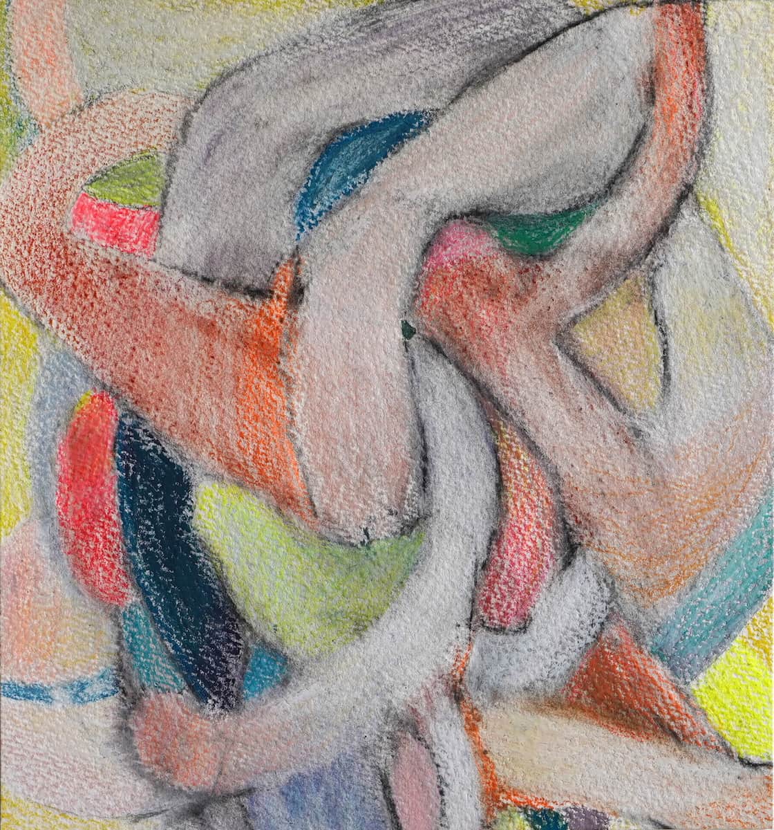
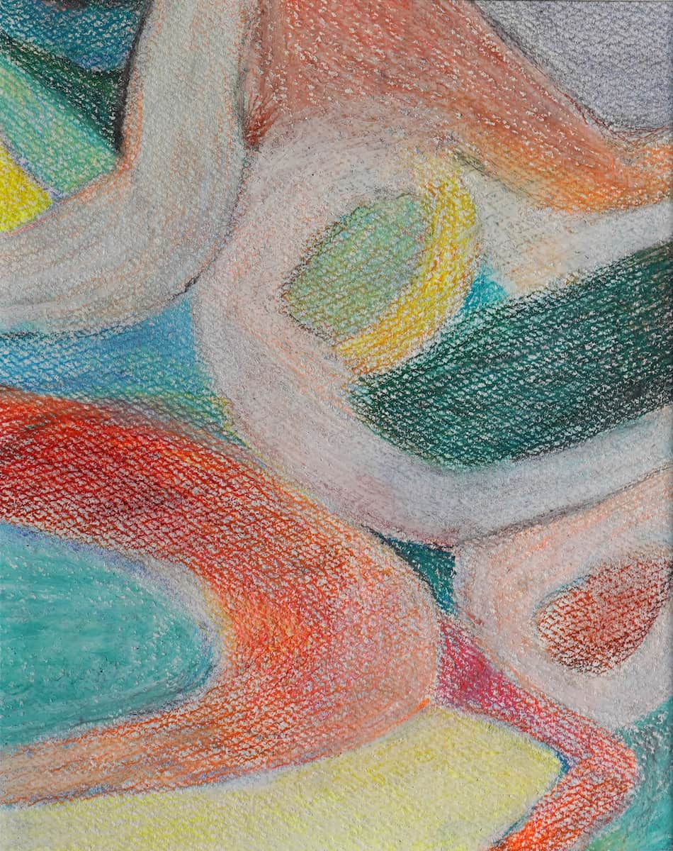
Marcie Begleiter: This series explores the relationship of intellectual knowledge and bodily sensation. I have a long-standing interest in hidden systems—secret codes, micro-organisms, and structures revealed by electron microscopy. The work is developed though broad gesture (body) and tightly controlled investigation (mind) therefore the biomorphic forms are an outcome of both intuitive mark-making and close observation.
Materials are graphite, sumi and walnut inks, watercolor and ceramic, with scales ranging from pocket- to window-sized. Inspiration and influences include Hilma af Klint, Lee Bontecou, and the scientific illustrations of Ernst Haeckel
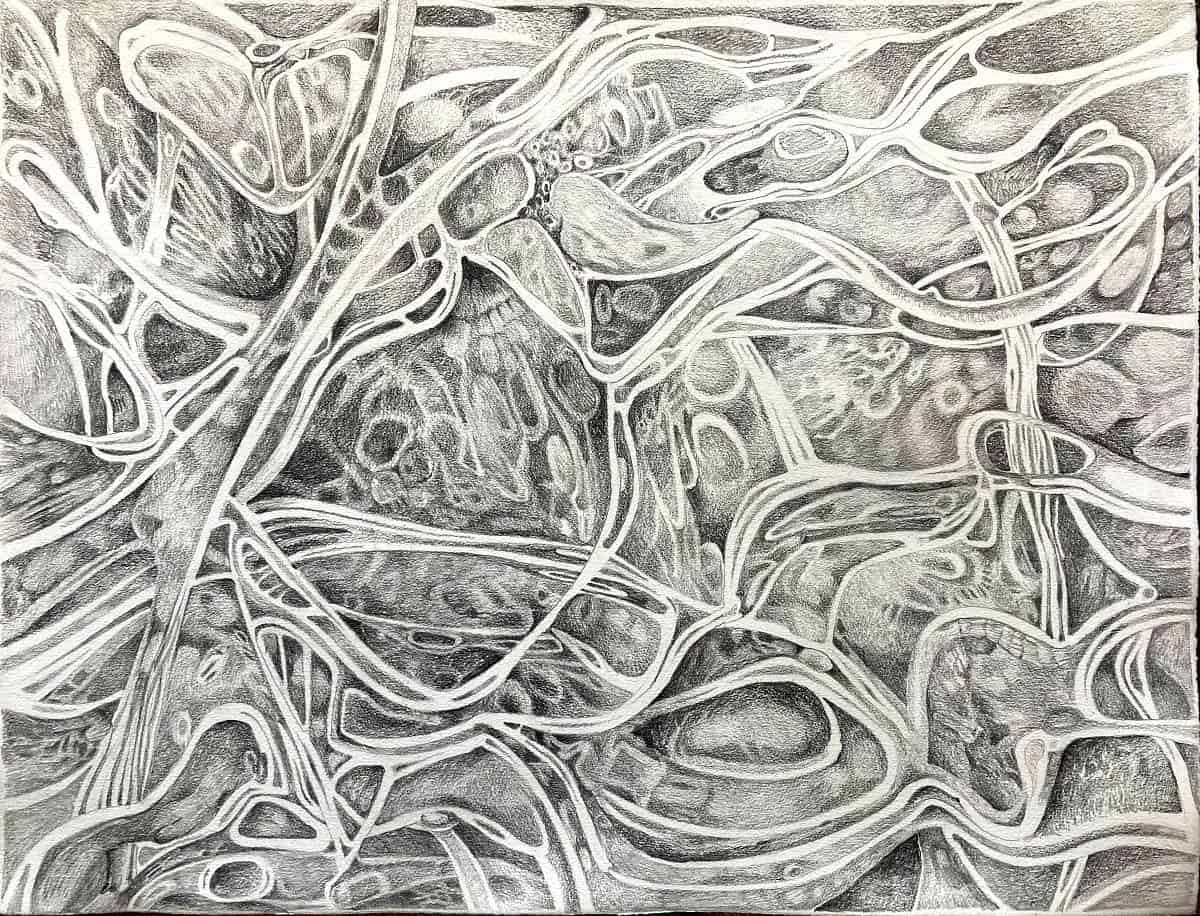
The Underneath (2021), graphite on paper, 22 by 28 inches
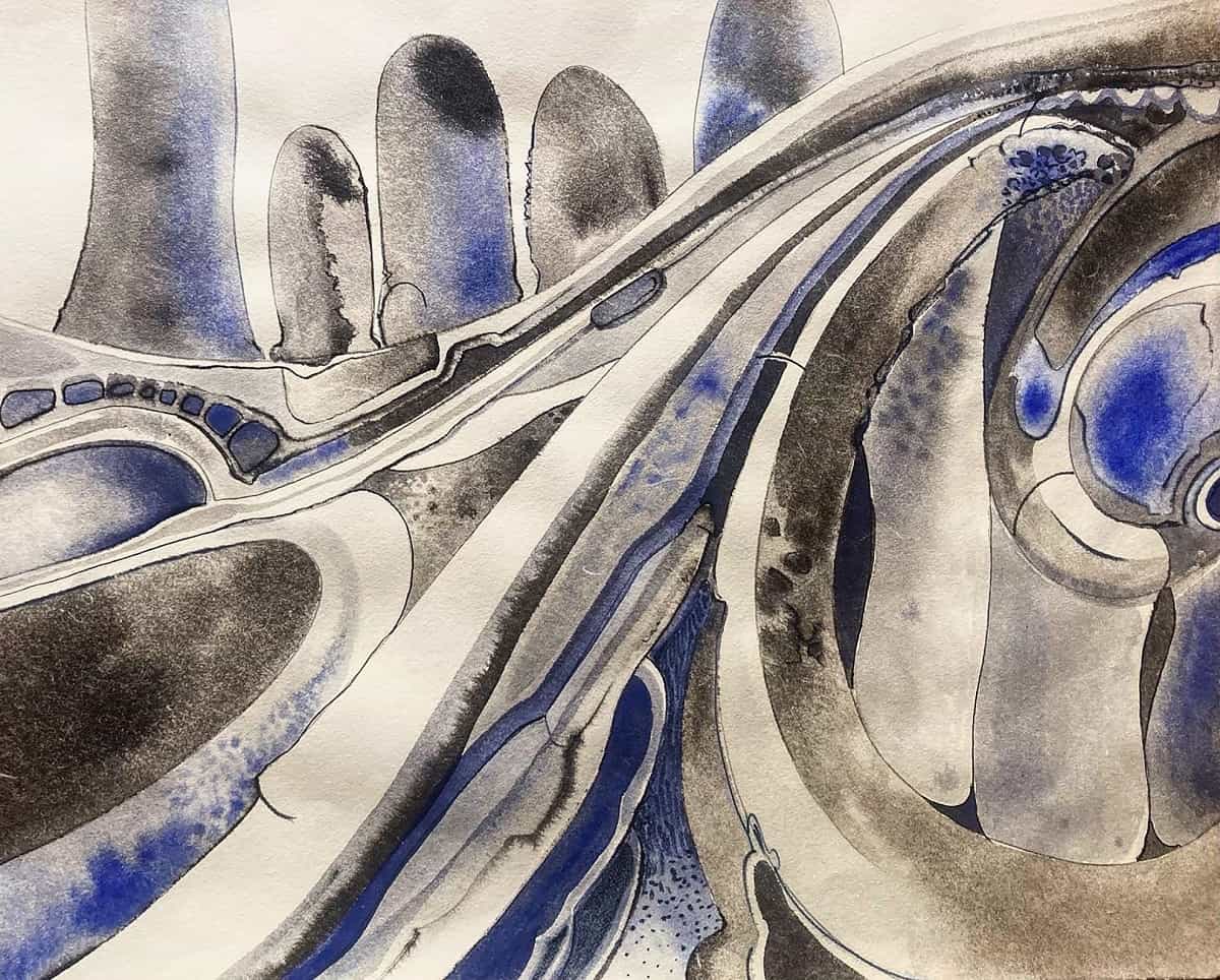
Waveform (2021), Sumi ink, watercolor, and pencil on paper, 17 by 22 inches
Leslie Kerby: Drawing gets me from point A to B when it comes to developing a narrative. I draw with graphite and I draw with ink in a printing process that allows me to “trace” a drawing, transferring the ink color onto white paper or papers with different colors. Both of these drawings are extensions of other series that I’ve worked on in the past. In Stimulus II, I am revisiting a shape from other drawings referencing the repetitive nature of public-housing architecture. Here I am using the same shape to express a different idea—the energy around the concept of stimulus. In The New Way I wanted to extend another series I made about the mechanics of the medical industry. I had planned to work on additional pieces that considered natural healing, wellness, etc., well before lockdown but was unable to make the work until now. I start with pencil drawings and trace them by laying the paper onto an inked plexiglass plate. Both the traced drawings and chine collé pieces on colored paper are run through the printing press–a big mixed-media collage.
Stimulus II (2021), graphite on Rives BFK paper, 30 by 22 inches
The New Way (2021), trace monotype with chine collé, 30 by 40 inches
Christopher Rico: What is drawing? Is it materials? Practice? Scale? Where does painting begin, and does drawing end there? Can one draw with paint? Can one paint with pencil, graphite, crayon, pastel, oil bar? Do the artists get to decide, or is the distinction the purview of critics, curators, historians, and arts writers?
Drawing is thinking for me. It’s how I process space and relationships and weight and force. I always drew or doodled in school, from elementary through grad school. It’s hard to think without a mark-making implement in my hand; impossible to make really important decisions without making visuals. One of my studio mates was drawing on the porch last night and said, “I trust my hand.” I love that.
Drawing is part of every foundation class. The practice of art is literally built on it. At its best, it’s never approached or executed in the same way. I love seeing artists’ drawings because (for me, and probably for most other artists), it’s like seeing how the mind works. I love sharing drawings because I think it shares something about how my mind operates, and maybe that’s interesting to someone, somewhere, now or at some later time.

Untitled (2021), acrylic on yupo paper, 12 by 9 inches
Untitled 2 (2021), acrylic on Yupo paper, 12 by 9 inches
Svetlana Rabey: Drawing for me is a hypnotic internal process of chaos and choreography. Arc-like shapes are repeated and layered, leaving behind a plastic continuity of movement and memory. The arc shape is a movement rather than a depiction. Like dance, it is a drawing in time. Evoking emotion, the lines overlap and invade each other, creating windows and tension in the foreground/background relationship. There are many points of entry for the eye to travel. I am interested in perception and how one looks through and at something at the same time. Tension lies in the controlled, silhouetted line of the painting gesture against the impact of the materials. I am interested in the tensions between control and release, movement and stasis, negative and positive space and repetition and difference. Repetition is a daily exercise, a disciplined rehearsal of forms.
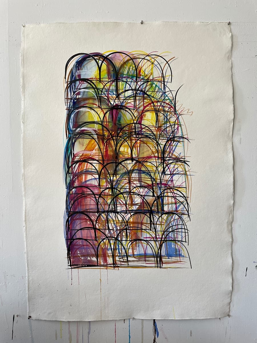
Untitled 1 (2021), watercolor on paper, 40 by 60 inches
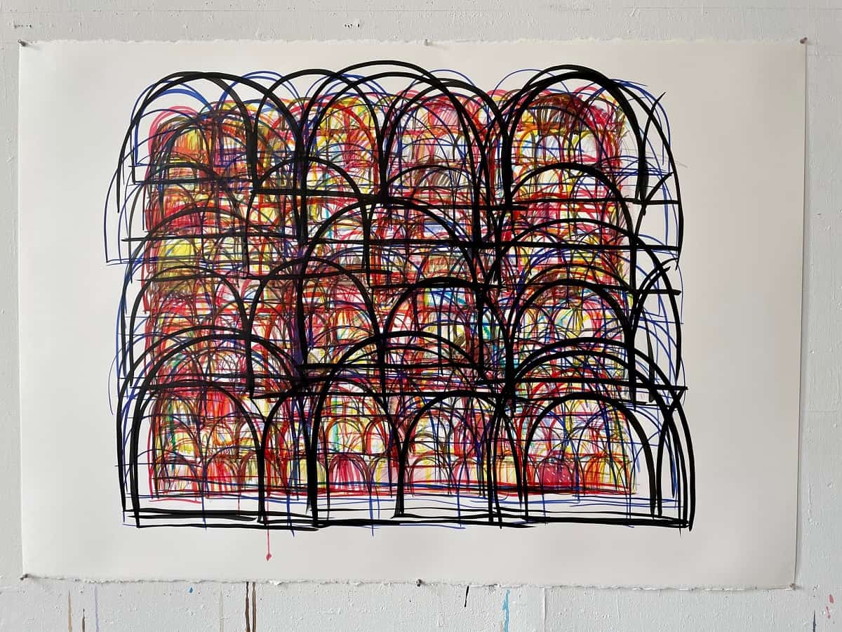
Untitled 2 (2021), watercolor on paper, 40 by 60 inches
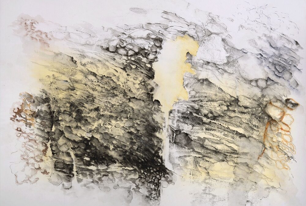
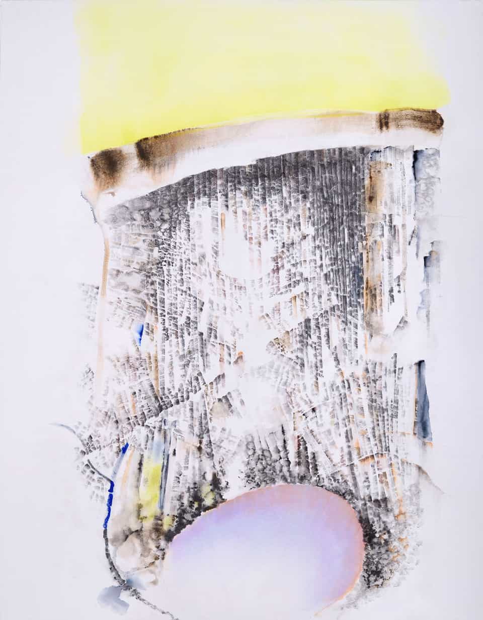
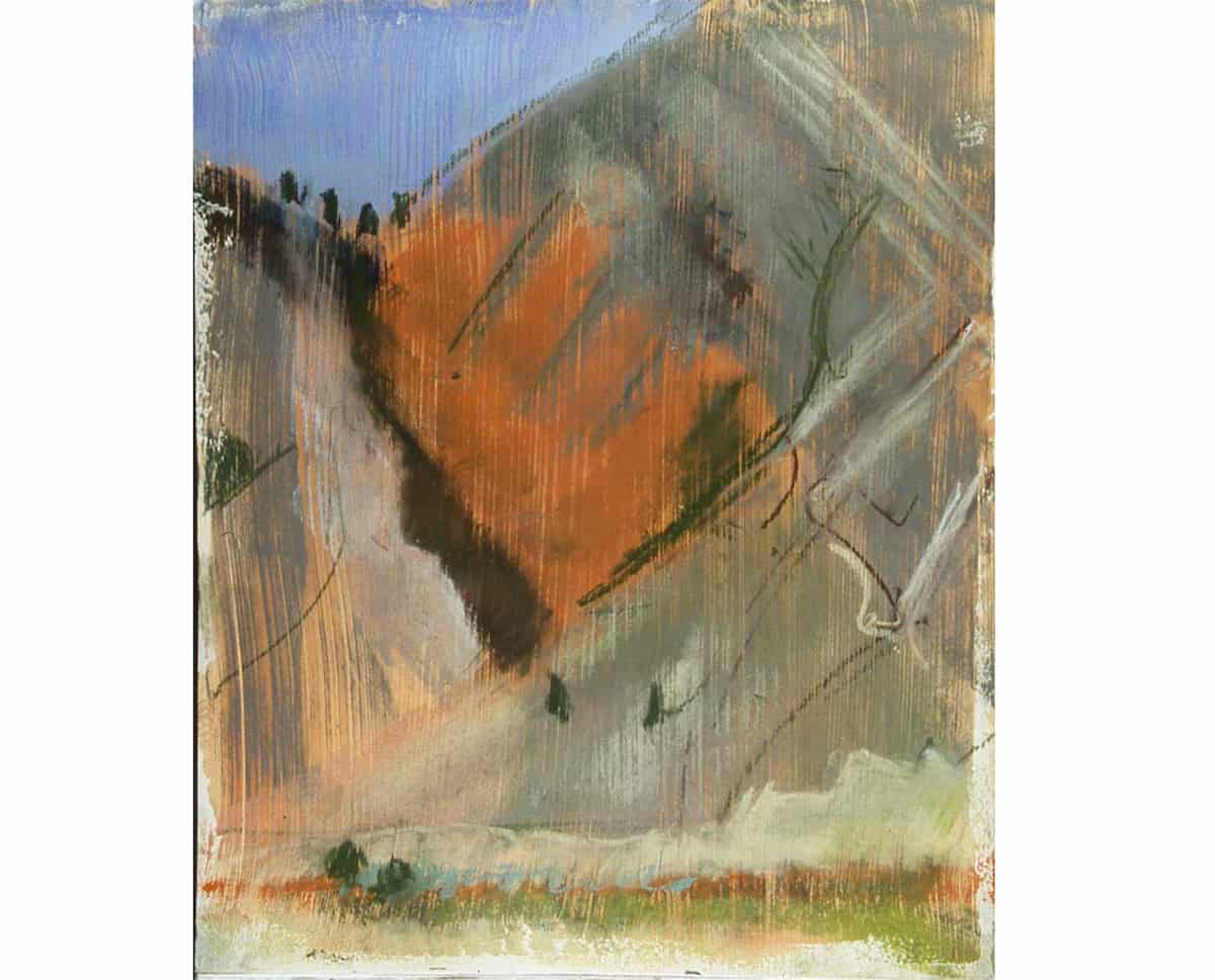
Christine Bourdette: My primary disciplines, drawing and sculpture, are informed by geologic features and fracturing earth, by the “impermanence of the enduring world” (Barry Lopez). I view the accretions, erosion, and metamorphosis of Earth throughout geologic time as inversely analogous to our relatively compacted experience as human beings. The cumulative distortions, upheavals, erratic shifting of terrain, seem to me metaphors for this era we inhabit, for a sense of surviving instability through instability. Though they represent qualities of landforms, I consider my works to occupy a zone between representation and abstraction, as reflections of a precarious tactile world, with a capacity for transformation and resilience: terra mobilis rather than terra firma.
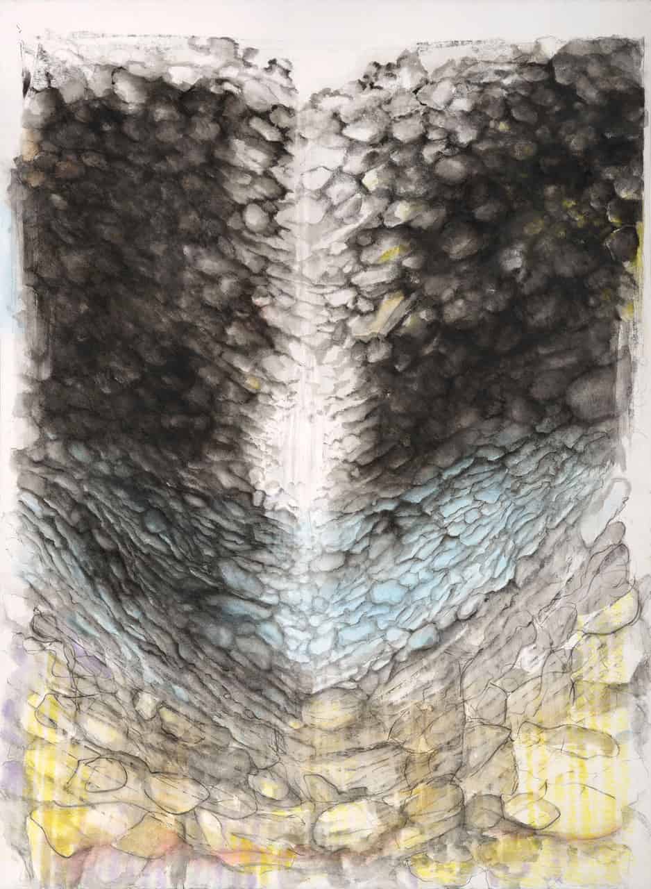
Endurance (2020), graphite and watercolor pencil on paper, 30.25 by 22 inches
Cenote (2020), graphite, liquid graphite, pastel, colored pencil, watercolor pencil, and ink on paper, 32 by 25 inches
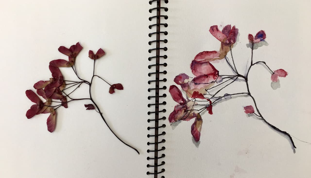
Elaine Forrest: As a multimedia artist, I love to draw with different implements, and I vary my materials, using colored pencil, crayon, pen and ink, oil, watercolor, oil paint or acrylic. Even when I make a sculpture, I consider it a drawing of form, light, and negative and positive space.
I don’t remember where I found the sprig of seeds from a plant, but I do remember wanting to capture the energy within the seed itself and found it amusing that my drawing so aligned with the actual sprig.
Putting pen to paper I included a pen and ink I did just a few months ago in the middle of Covid. The repetition of fine ink-line drawing is calming. But then came the burst of color on the bird.
Sketchbook drawing (2019), pen and watercolor, 7.5 by 12 inches
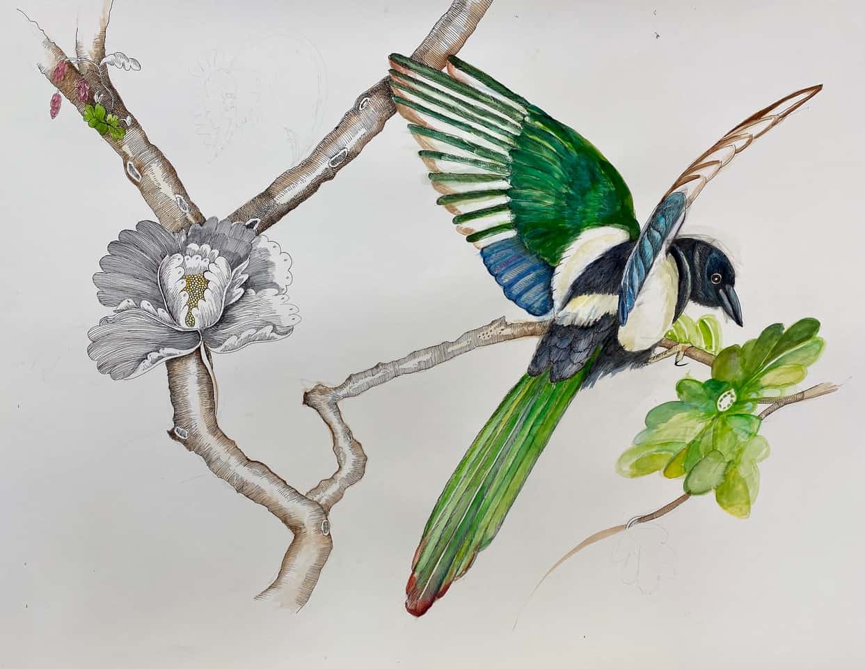
Vine and Bird (2021) pen ink watercolor, 30 by 26.5 inche
Robyn Ellenbogen: “The Tree Tablets” are recent metalpoint drawings with trees. The past year of pandemic and a move to New York State encouraged my awakening love of nature. Trees have become intimate friends through this time. The tablet form allows me to draw with trees while dissolving the confinement of geometric formats. I’m drawing on basswood, it’s relatively soft and and encourages a feeling of drawing as engraving. I think of tablets as a reference to ancient surfaces that were inscribed with drawings and/or texts, often on clay, stone, or wood. The tablets are collaborative, organic, and interconnected. I continue ongoing investigations where the macroscopic world is reduced to the microscopic world of particles, waves, water, and unseen creatures.
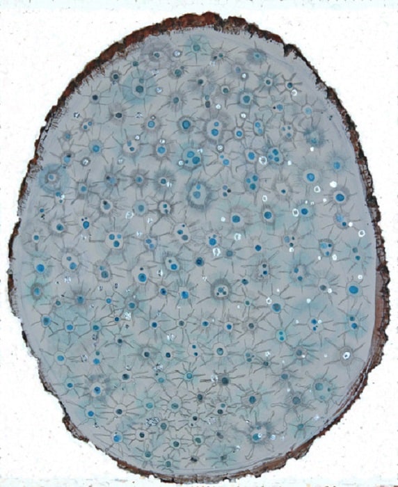
Each One Cried For Another, assorted metalpoint (silver and aluminum) silver leaf, liquid graphite, watercolor. 12 by 10 inches
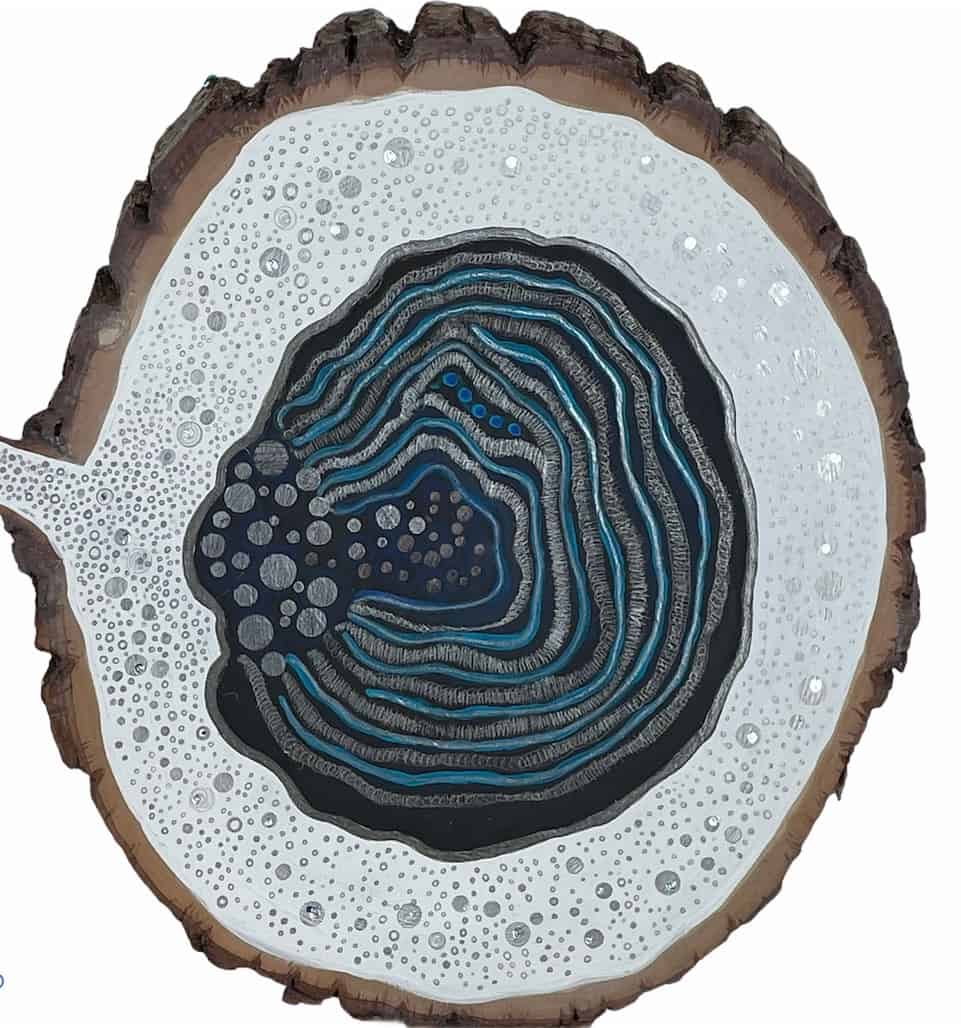
The Face Before You Were Born, assorted metalpoint (silver, aluminum, copper), metal wire brush, flashe, pastel powder, silver leaf, 9 by 9 inches
Annie Shaver-Crandell: My preferred support is heavy watercolor paper, coated with pastel gesso and laced with pumice gel, stained with fluid acrylic. Depending on what I plan to draw, it can be fun to sculpt the gesso into patterns. Because I’ve already been handling the support through the phases of prep, and the wait for the stained gesso to dry, I’ve already been thinking about what’s to appear next on the surface. I’m not intimidated by a blank sheet — a bit like leaving off one’s writing in mid-paragraph in order to attack with vigor during the next work session. I’m happiest working with both hands, something I do with no other medium. Gloves and a long apron are essential.
It seems ironic to me that our English adjective, pastel, implies a faintness of colors that is utterly unlike the brilliant possibilities of the noun pastel, as an artist’s medium. I like the immediacy of laying down dry pigments that retain their value and intensity. I don’t have to calculate a loss of either characteristic during drying, as I would with watercolor or oil.
Orange Rocks, Jefferson River, Montana (1999), 13 by 11 inches
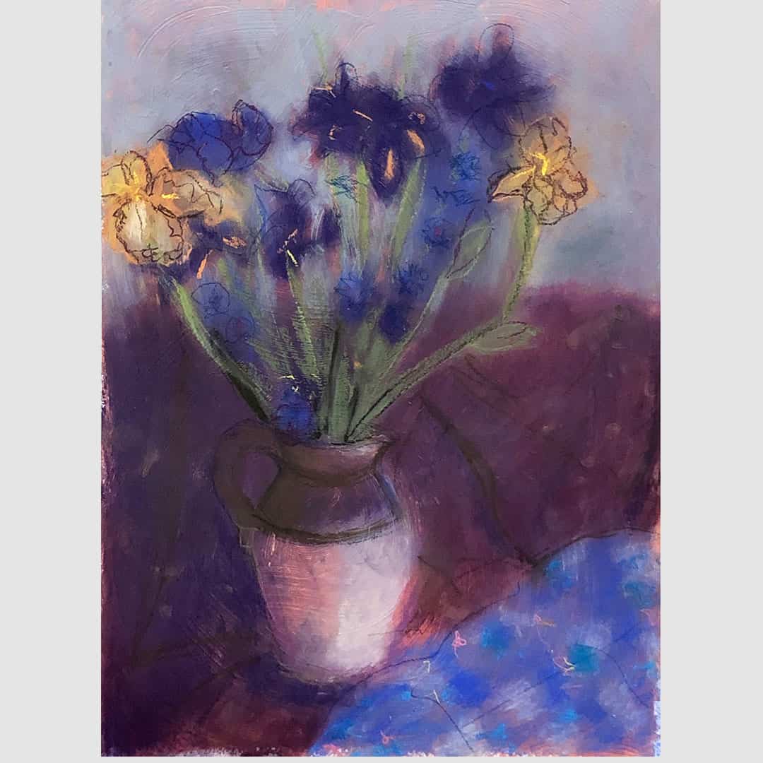
Irises and Friends (2019), pastel, 28 by 22 inches
Leslie Parke: I’ve been having conversations with Giotto di Bondone (ca. 1267 – 1337, born in Florence, Italy) since I was twelve years old and my class studied the Renaissance. The conversation became obsessive when in 1987 I created a cycle of paintings recreating the frescoes of the Arena Chapel on seven shaped canvases, the largest of which is 18 by 24 feet. There are three stories about Giotto. One is that as a child as he drew a sheep on a rock. The great painter Cimabue saw this and was impressed and invited him to become his apprentice. Another is that one day while Cimabue was out, Giotto painted a fly on Cimabue’s self-portrait. It was so realistic Cimabue tried to whisk it away several times. Many years later, the fly became a symbol of the artist and was inserted frequently into Dutch still life paintings. But it is the third story that has occupied me recently.
Vasari, the chronicler of The Lives of the Artists, relates that when the Pope dispatched a messenger to Giotto, asking him to send a drawing to demonstrate his skill, Giotto drew a red circle so perfect that it seemed as though it was made using a pair of compasses and instructed the messenger to give it to the Pope. The messenger departed ill pleased, believing that he had been made a fool of. He brought other artists’ drawings back to the Pope, in addition to Giotto’s. When the messenger related how the artist had made the circle without moving his arm and without the aid of compasses, the Pope and his courtiers were amazed at how Giotto’s skill greatly surpassed that of all of his contemporaries.
In the winter of 2018, I started to paint circles, and of course I thought of Giotto, but never more so than when I began to draw them on a large canvas.
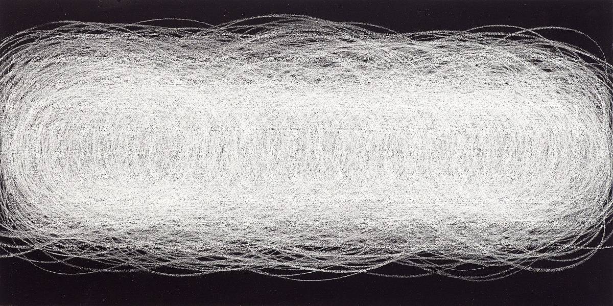
Accelerating Geometries (2018), silver graphite, 18 by 24 inches
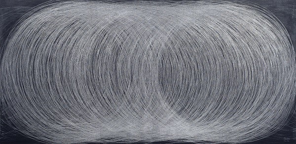
Conversations with Giotto (2018), silver pencil, chalk, chalkboard, paint on canvas, 46 by 94 inches
Camilla Fallon: These drawings were made during last year’s lockdown. I made them from observation exclusively because the exercise was grounding. I was compulsive about making a drawing a day, like a diary. I regarded these domestic objects with ardor and strived to make the marks on the paper reflect their presence and spatial relationships. The drawings feel casual, yet the work in the studio feels riskier: it takes preparation, thought, planning, materials. My home studio makes for a more easeful approach. In some ways, these drawings feel more authentic and less self-conscious than others I have made.
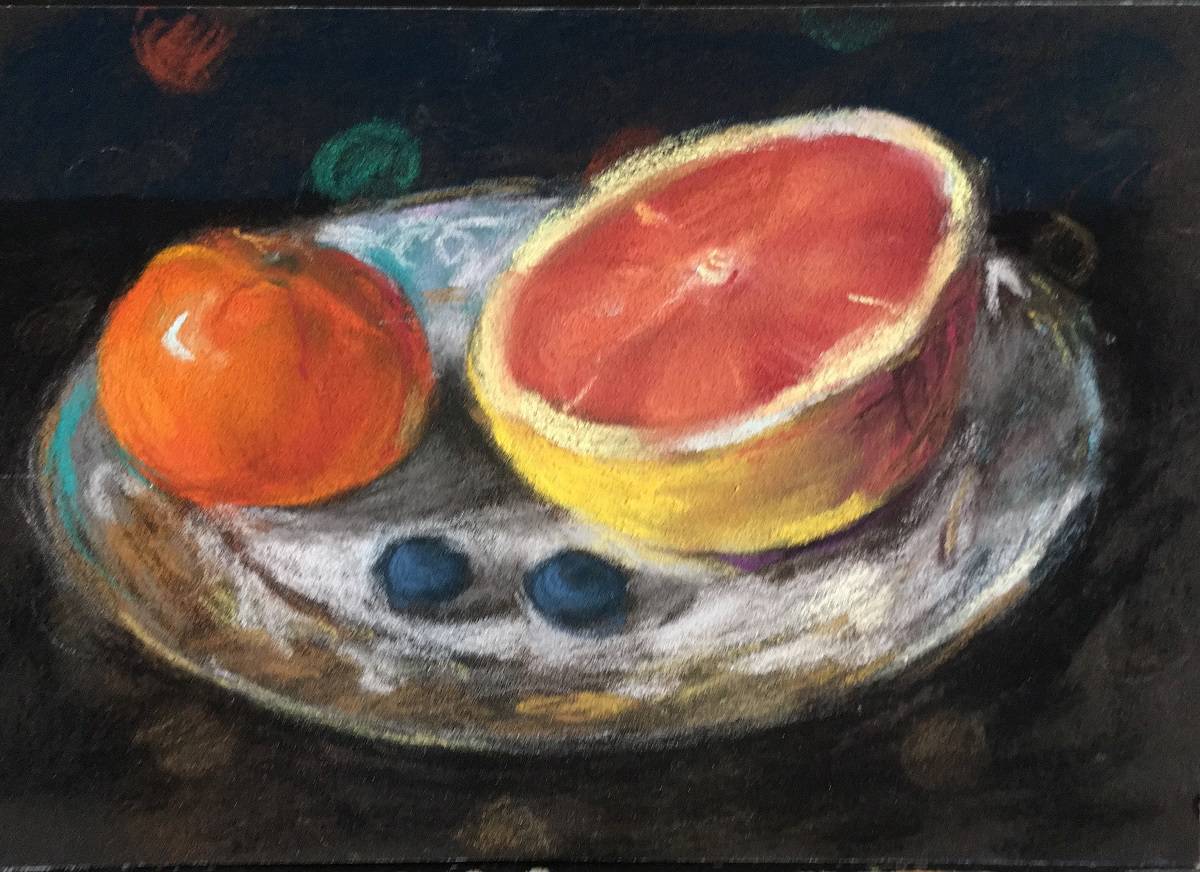
Grapefruit on a Plate (2020), pastel on Sennelier paper, 6 by 9 inches
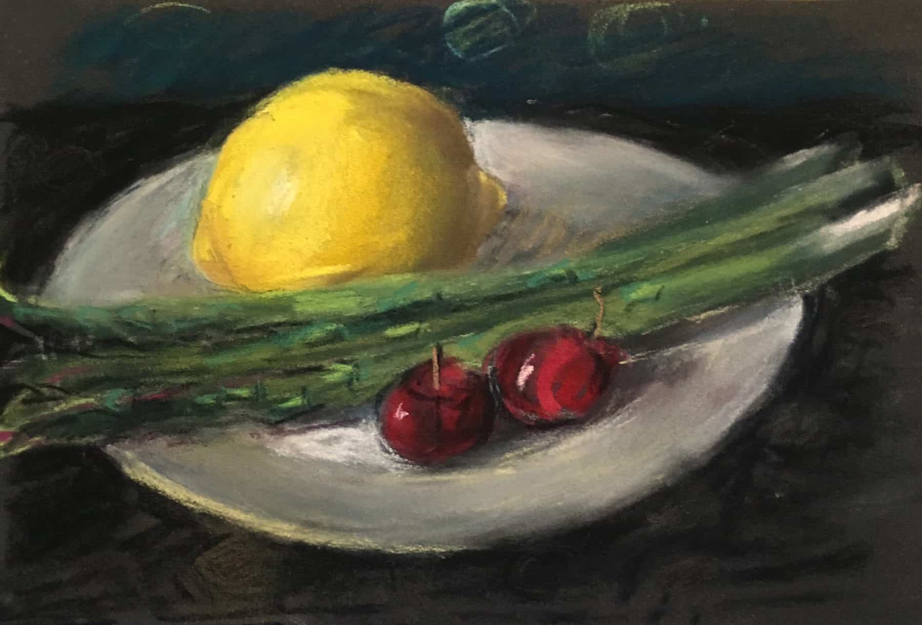
Asparagus, Lemon, and Cherries (2020), pastel on Sennelier paper, 6 by 9 inches
Barbara Grad: A painting exhibition of my large work had been installed in March 2020 and one day later the city went into lockdown. The large oils returned to my studio four months later, but the building never re-opened and the work was never seen. I decided to go out to the garden and do some damage. The 100-year-old mountain laurel up the driveway hadn’t been cared for in years. I made my way around the tree, chopping out all the dead branches. Soon I realized I had some pretty interesting shapes. I was healing the plants, promoting new growth, and at the same time healing myself. Then I went back to the studio and began making small drawings.
Small World (2020), crayon, gouache, and watercolor,14 by 11 inches
Notes (2020), crayon, gouache, watercolor, 14 by 11 inches
Samantha Palmeri: The “Sublimation” series was created at the height of quarantine. These are mixed-media drawings on watercolor paper. The paper itself was from a pile in my studio of older, unresolved drawings and paintings, half-finished and discarded. The stripes were drawn directly on top of these older works, with remnants of the layers underneath still visible. A mix of wax medium, pastels, colored pencils, and pigment created the textured surface. This physical act of smoothing over something unwanted, beautifying the ugly, you might even say, is a perfect metaphor for emotionally navigating through the pandemic.
Sublimation #5 (2020), pastel and colored pencil on 300-lb. cold-pressed paper, 9.5 by 10.5 inches
Sublimation #10 (2020), pastel and colored pencil on 300-lb. cold-pressed paper, 8 by 10 inches
William Norton: My drawings are my liberation. I’m free to do anything I want because they can usually be done in one day (excluding framing). This speed of execution allows me to be juvenile, angry, silly, or experimental, as they can ultimately be replaced by another on the following day. Framing does help add content, or at least a visual sense of completion to a piece. In the case of World Cop Pruning In the Garden, I believed it was important to make a frame that added a sense of upper crust, bank-manager legitimacy to the manifestly juvenile and yet horrific image of the Cop in Full Battle Gear.
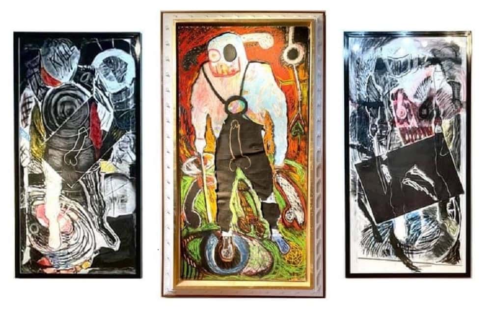
William Norton (from left to right, all 2020-21): Fuck U Up, mixed media, 60.75 by 98.75 inches; World Cop Pruning the Garden, mixed media, 64 by 112 by 7 inches; Knock Knock—Who’s There? mixed media, 98.75 by 50.75 inches
Patricia Moss-Vreeland: In one drawing, I cast a light on the different realities we experience, contrasting Nature with humanity’s impact on place through images of pipelines and petrochemical and nuclear energy—all as disparate parts to form a whole that doesn’t quite work out. In another, I portray a variety of women providing services that are often invisible, to find connections to places we may not inhabit that still affect us, with hope to inspire awareness.
Alternate Realities (2021), graphite, watercolor, colored pencil, pastel, 22 by 30 inches
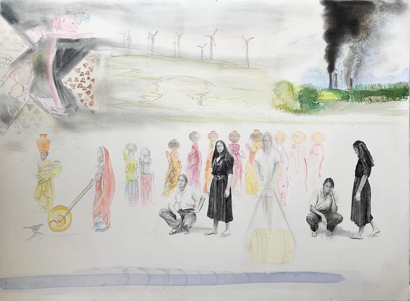
The Economy of Being a Woman (2021), graphite, charcoal, pastel, watercolor, 22 by 30 inches
Top: Christine Bourdette, Pinch (2020), graphite and watercolor pencil on paper, 22.25 by 30 inches