In which your intrepid reporter takes a class in encaustic monotypes with Paula Roland
Roland doing a demo in her studio
Given the number of Vasari21 members who work in encaustic (see Anna Wagner-Ott’s report from last summer), I thought it might be fun to get a firsthand look at why the medium is so popular with so many. So I jumped at the chance when Paula Roland, whose teaching earned high praise after I published a profile of her on the site, graciously invited me to attend a workshop on monotypes and mixed media in mid-April at her studio in Santa Fe, NM. I couldn’t be on hand for the four full days—otherwise nothing would be produced for the site that week—but I dropped in for the first day and quickly grasped why the medium is both alluring and maddening.
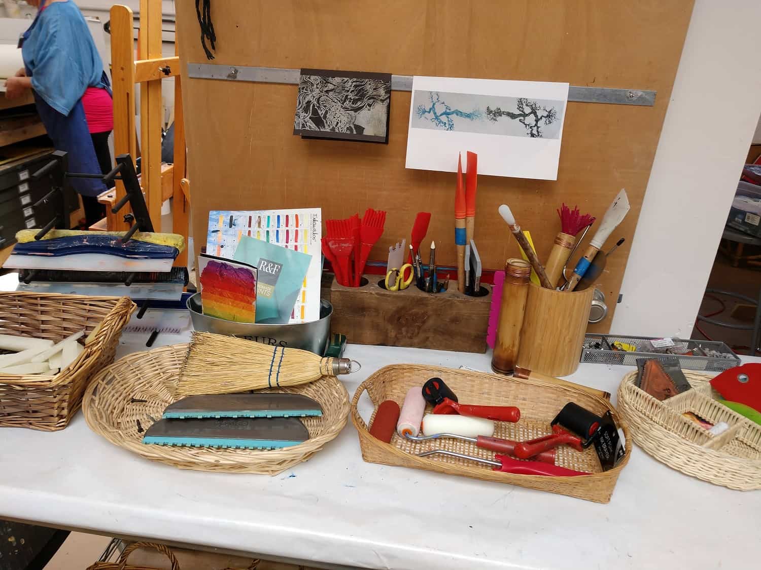
Some of the tools for making encaustic monotypes
Paula first explains her own background as a teacher and how she learned the process while living in New Orleans in the 1980s. Then the six members of the group introduce themselves one by one. We are a varied bunch of women, six in all from four states, including three from New Mexico; in age (though I don’t ask), we range from our 50s through 70s. Everyone, it quickly becomes clear, has a lot more artmaking experience than I do.
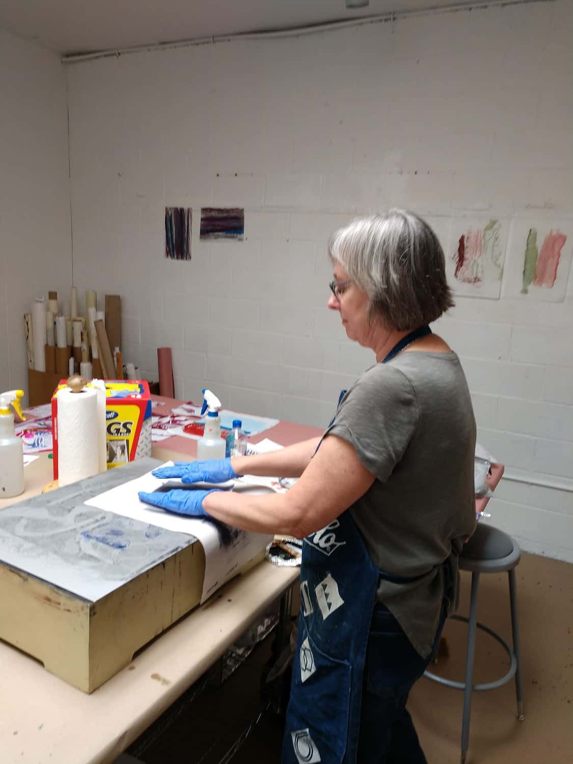
Karen Battles cleans her plate
Day one is about the basics. The works we would be producing in the workshop, Paula explains, are known as monotypes, not monoprints, because they are one-of-a-kind, impossible to repeat because there is no matrix, though often an interesting “ghost image” can be pulled from the melted wax that remains once the first sheet of paper has absorbed all that it can from the hotbox. This is a vital apparatus containing four ordinary light bulbs affixed to sockets, surrounded by insulation, and surmounted by a aluminum plate. Our equipment, and we each get one to work with, is Paula’s own trademarked Roland HOTbox. The bulbs heat the plate, and that in turn melts the encaustic (pigmented wax).
Next she gives us an introduction to papers and pigments. The variables of paper are easy to grasp: thin gets saturated easily, thick can hold more of wax. Coated surfaces (“closed stock”) are less absorbent; a rough or fibrous finish produces more broken lines and lends more texture to the print.
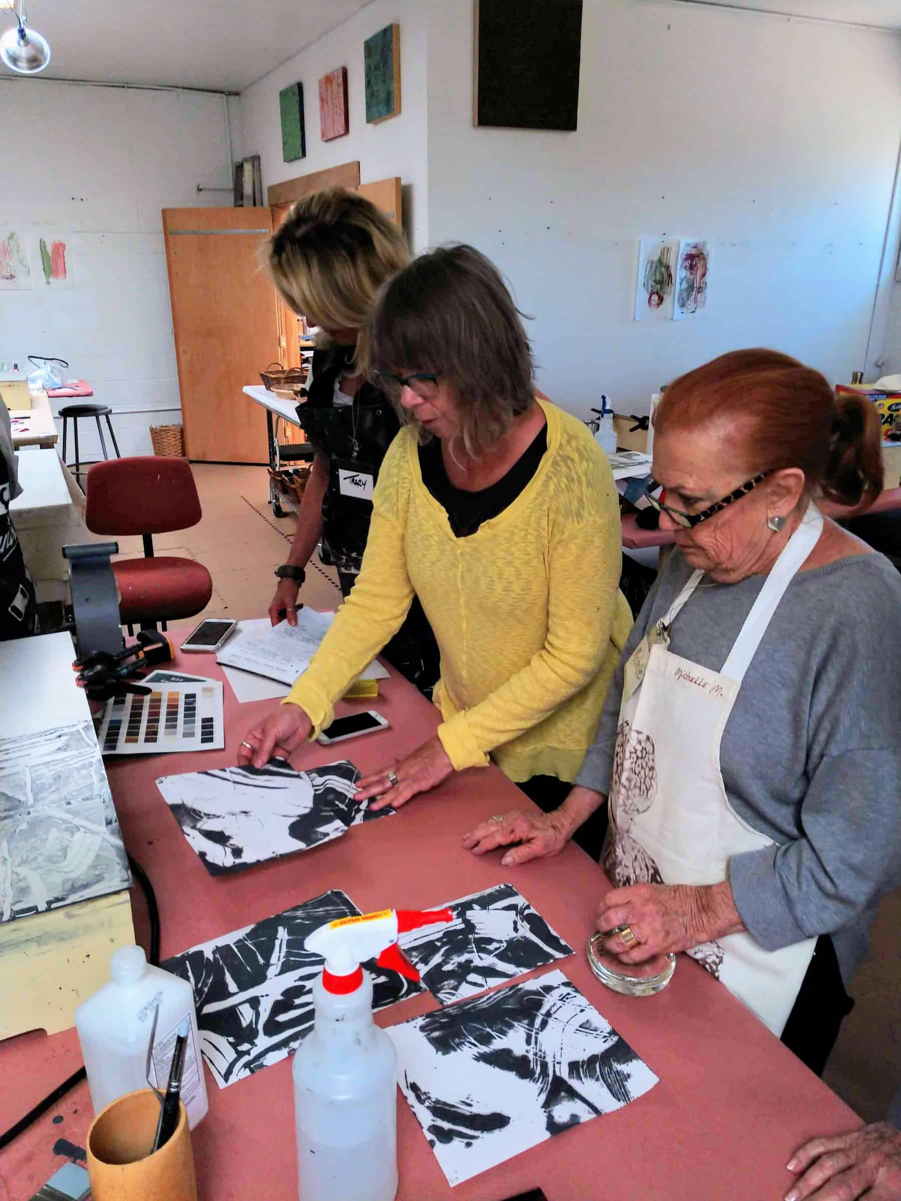
Tracy King, Judy Brey, and Michelle Metcalf at work on our second exercise
Colors are a trickier proposition but explain the huge appeal of the encaustic process: “It’s easy to get gorgeous color,” Paula says, “and each pigment will vary from translucent to opaque depending on its chemical nature.” The colors on hand for the workshop are compressed into thin or chunky sticks, and results can vary depending on the manufacturer, as Paula demonstrates with three sticks of white, which differ in both tone and density.
And then there are the differences between “dry” and “juicy,” “particle size” and “pigment weight”….and I start to remember why I was never much good at high-school chemistry. But some basics are easy enough to understand, like the temperature range for making a print—between 160 to 185 degrees Fahrenheit. There is even a gizmo, an infrared thermometer about the size of a computer mouse: hold it above the plate, push down on a button, and there’s your temperature. “In general, encaustic paints have resin, which melts at a higher temperature, so that you will have a harder surface that will polish well,” she adds.
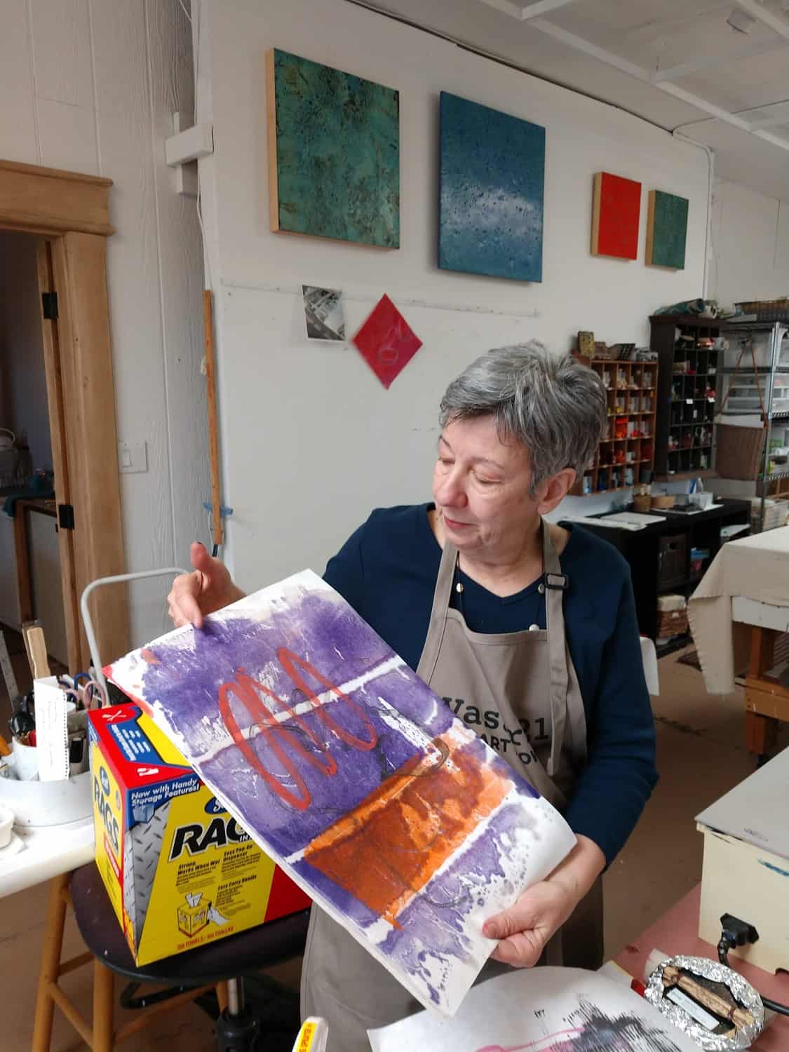
My feeble first attempts
We also get a lesson in some of the tools that can be used with prints, varying from printmaking barens to press down on the paper to ridged scrapers to marking tools that rearrange the wax and pigments. A sheet of newsprint on the back of the paper can be used to absorb excess color. And, of course, how to clean the plates once we have made a fine mess of the surface. Hint: Scott rags do a much better job than paper towels, and a little water from a spray bottle helps pick up the residue. Plain old rubbing alcohol can take care of the rest.
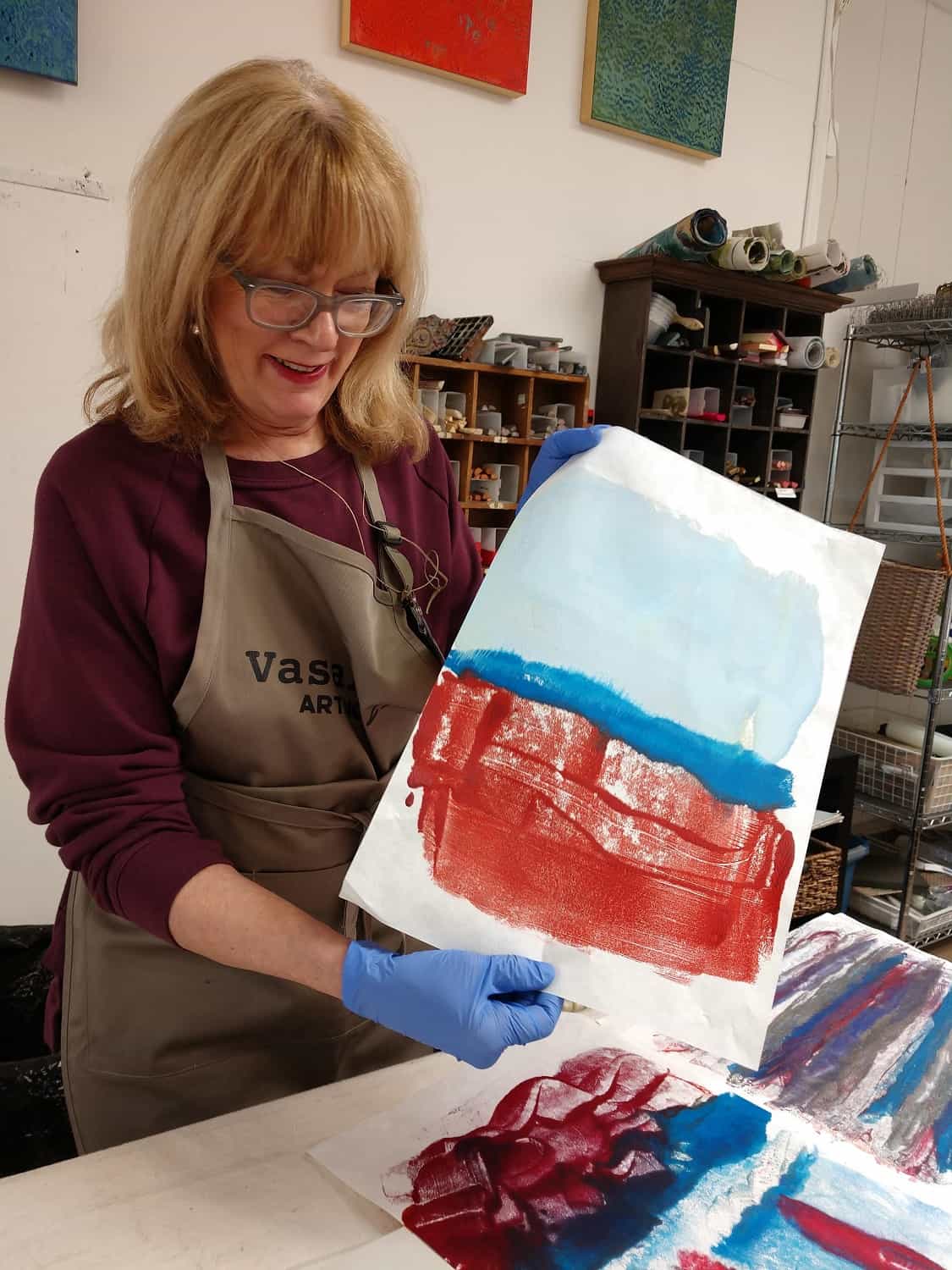
Our first exercise is relatively straightforward: Take a few colors, three to five, and see what you can do with them, what kind of marks you can make, and what you notice about the process. I share a table with Karen Battles, from Massachusetts, who from the outset shows a great deal more confidence about what she’s doing than I can muster. I figure it’s best to keep it inanely simple and with three colors—a baby blue, a strong cobalt, and a deep red—aiming for Rothko-like blocks just to see what happens. A lot, it turns out. After melting the colors and pressing down on heavyweight Masa paper, I pull away a nice swoony rectangle of red with more solid masses of light and deep blue. But Rothko would be spinning in his grave.
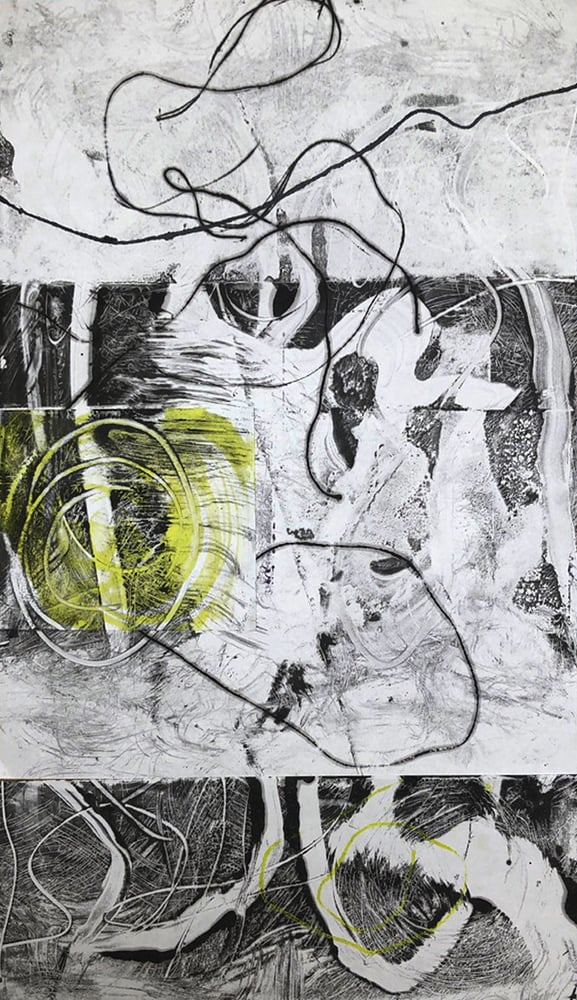
From the outset, Dianna Shomacher’s monotypes showed a buoyant lyricism
Thinking I have the knack of allowing colors to bleed into one another, I add some iridescent pewter and hope I might get a kind of Morris Louis veil-type effect. That looks appallingly simple-minded too, though ratcheted up to a bigger scale—using, say, a hot box the size of a bed sheet—it might be somewhat impressive while simultaneously blowing all the circuits in the studio.
Paula explains the basics of positive and negative spaces
When we compare results at the end of the exercise, I’m embarrassed by my first attempts. Some, like Dianna Shomacher, seem to have immediately and intuitively grasped the potential for lyrical lines and arresting shapes. I’m still stuck in kindergarten.
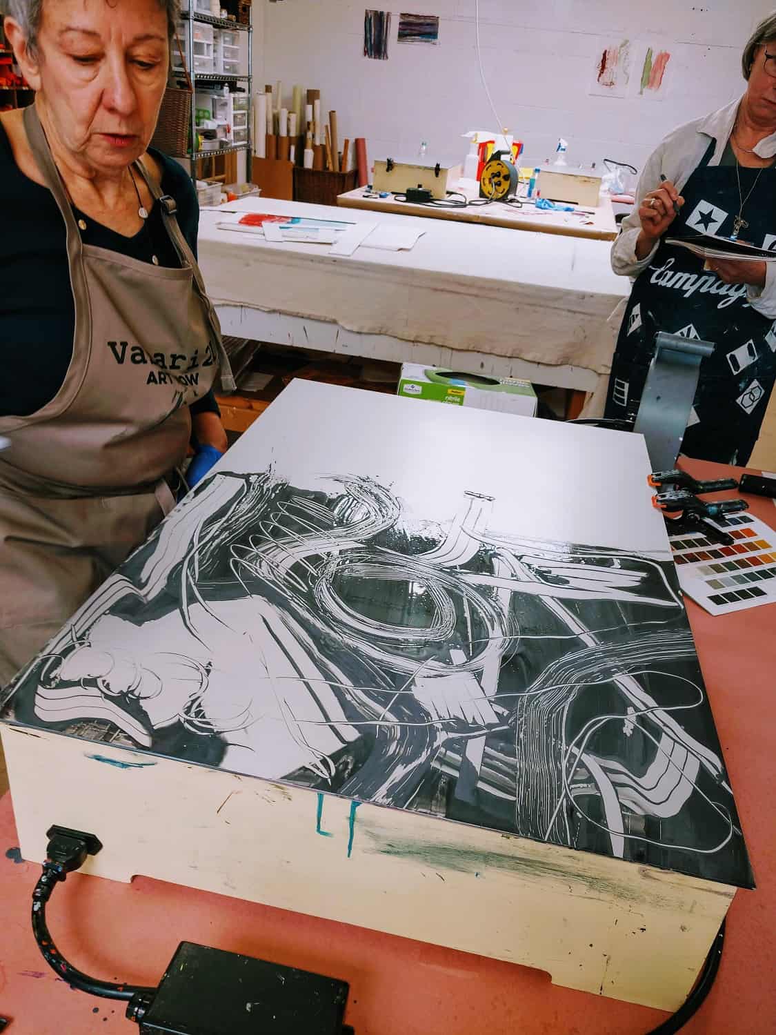
Next Paula launches an exercise with negative and positive shape (probably a concept familiar to anyone who has ever taken a class in elementary composition, which I have not). Using a block of dark gray encaustic, she spreads the pigment across the hot box, then uses various tools—squeegees, ridged comb-like things—to create what to my eyes is a rather thrilling surface of swoops and arabesques. Just perfect as is. But, no, that’s not the end of it. Instead of printing the plate as a whole, she takes several different-sized rectangles of paper and presses down to make many smaller print compositions.
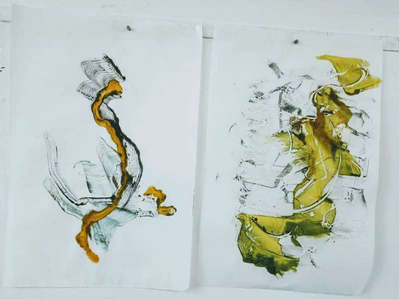
Some of Roland’s monotypes from an as yet untitled series.
I choose a deep crimson to drag across the heated surface and mess around with the tools till I get a nice balance of positive and negative, parts of it resembling ribcages or blood-soaked X-rays, and then as instructed press down with the smaller rectangles. I also make a “ghost print” from the residue on a large sheet of Masa paper, little suspecting that this may be my chef d’oeuvre for the day.
And then, thank goodness it is time for lunch, and a chance to look at Paula’s highly accomplished works on the walls of her adjoining break room.
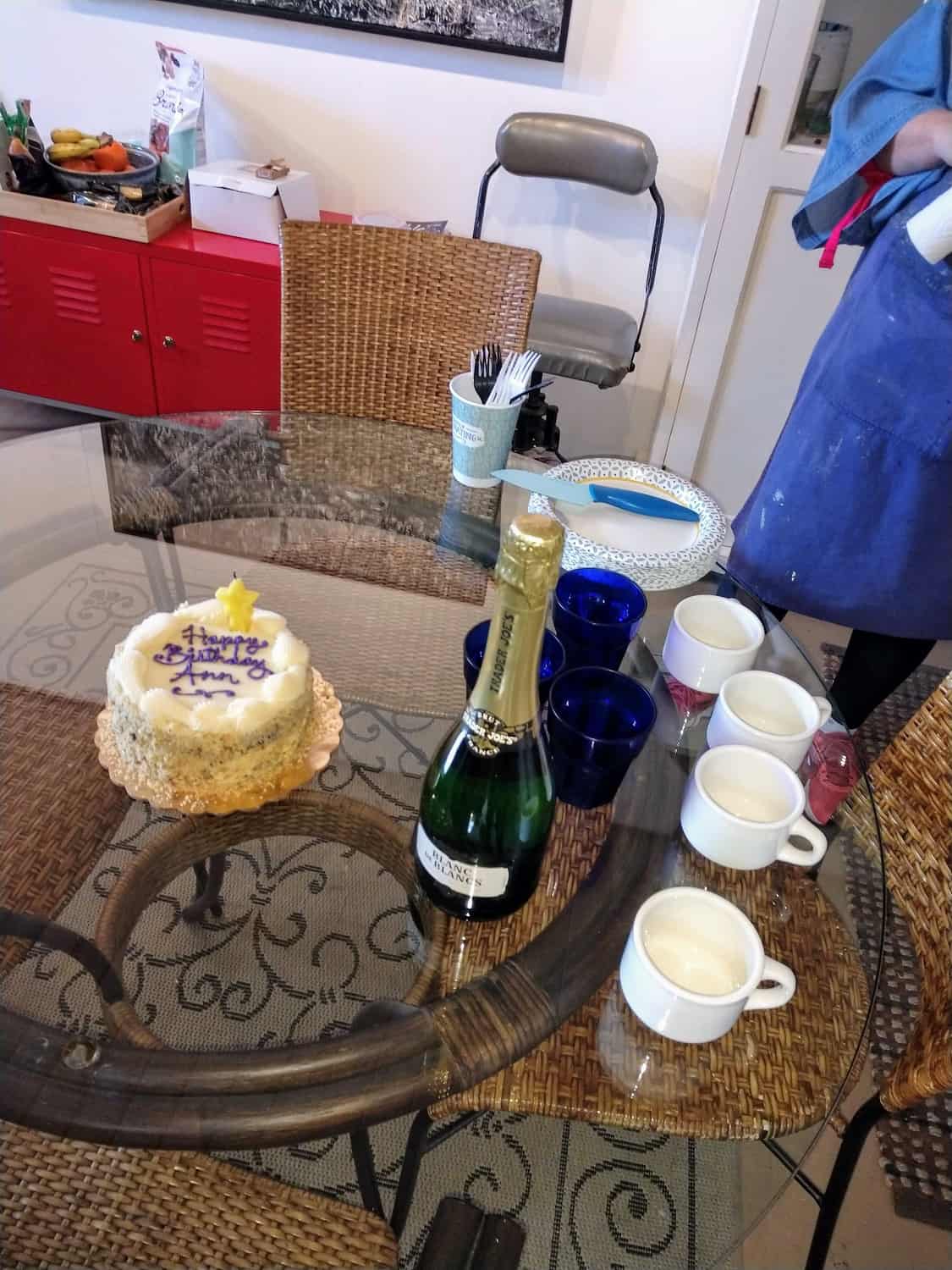
Happy birthday to me!
After we’ve chatted a bit and refueled, Paula demonstrates some possibilities for adding zip with unexpected materials—like swishing a string through hot wax to get an intriguing line—and we all go off to add some pizzazz to the negative-positive studies. I add blue, hot pink and silver to a small square and am much more pleased with the contrasts and composition than with the morning’s efforts. Paula gives me the ghost print of her last session at the hot box with instructions to work on it, make it “juicier.” So I press the paper down on some splotches of hot pink. When she examines the results, she suggests adding collage to simplify busy areas. I cut out some swirls of paper and add those to the mix.
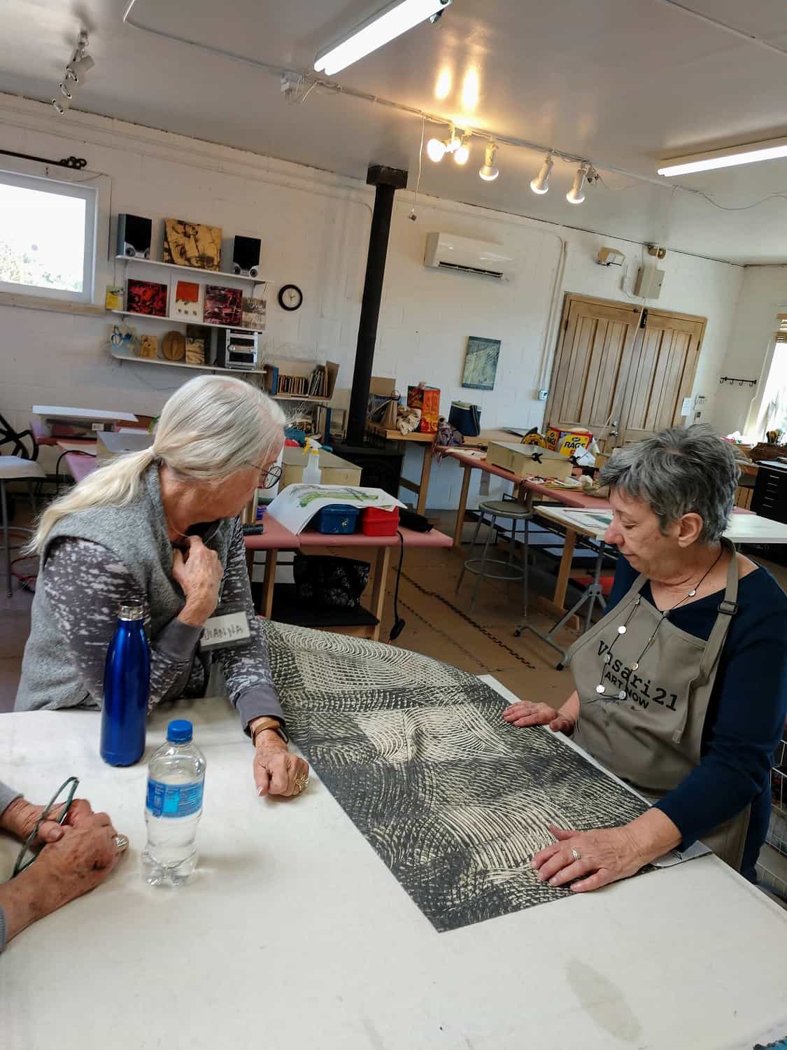
Dianna and Paula examine a work from Roland’s “Sightlines” series
Mid-afternoon, Paula calls out, “Ann, come join us!” And I head off to the break room to find a bottle of champagne and a cake emblazoned with the words “Happy Birthday, Ann.” Yes, it’s a day I was doing my best to forget, but Paula kindly remembered. So I slice everyone a wedge of scrumptious carrot cake as Paula’s assistant, Jamye St. Romain, pours cups and glasses of bubbly.
One of Karen Battles’ monotypes from later in the workshop
The rest of the day gets a bit muzzy, especially after a second hit of champagne, but I notice that Paula finds ample time to spend with each member of the group, and I cruise the studio, admiring the efforts of the others. I also continue to fool around with a 15.5-by-21.5-inch sheet of Masa paper, on which I’ve made a ghost print, adding a large blue rectangle and some grace notes with a silver oil stick. And we study some of Paula’s prints, my favorite being a series she has made from curving black parallel lines on buff-colored paper, both minimalist and austerely elegant.
And then, after a full ten-to-five working day, it’s time to call a halt. The other group members will return to complete dozens more prints, have discussions about their work, and ultimately find a path of interest to pursue.
Have I learned anything? For sure. Next time I see a monotype in encaustic I will know how much skill and effort goes into the simplest of images. Would I get better? Probably, as you can judge from the group’s scroll exercise later on in the workshop, as well as Karen Battles’ snazzy monotype collage.
Above all, it’s good to know that viable careers can be forged from this medium, as demonstrated by David A. Clark, one of Paula’s students, whose work was shown OTA Contemporary in Santa Fe this month.
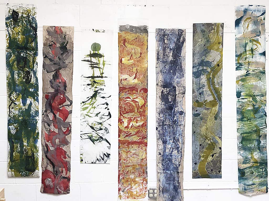
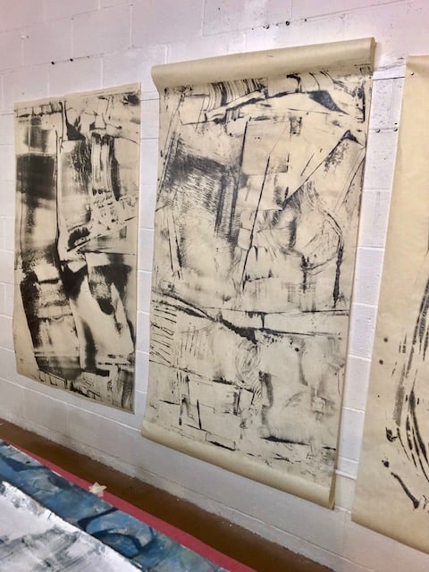
The group’s “scrolls” from the second and third days of the workshop
So there is hope for everyone.
Ann Landi
For more information on Paula Roland’s art and workshops: go to rolandworkshops.com and paularoland.com
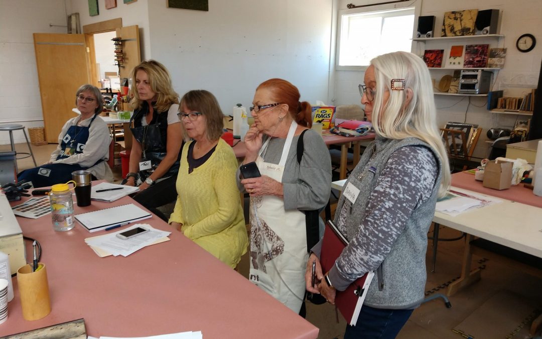
Top: The group gets ready to rock’n’roll: (left to right) Karen Battles, Tracy King, Judy Brey, Michelle Metcalfe, and Dianna Shomacher
Thank you Ann for your adventurous spirit in attending. (You won’t find me attending any writing workshops, though it may be helpful).
You did a wonderful job capturing the spirit of the class. Thank you again for your support of artists. I am always amazed at how much you do for the art community across the country, and how well you do it.
Ann,
Terrific account of your time with Paula — thanks for making some of the Evans Encaustics paints look good!
Is there a way to mount encaustic monoprints on to a wood cradled board?
Janeen,
Yes! in fact there are at least three ways to permanently affix monotypes and monoprints to panel and I demonstrate all three in most workshops that include monotypes.
I also discuss framing and ways to display free hanging paper that look very contemporary.
I am considering a mini workshop in these topics so make sure you are on the mailing list for rolandworkshops.com by going to the site and signing up.
Cheers, Paula
Ann,
Thanks for your great article. I found it to be informative, humorous and an inspiring account of some of the magic of working with both Paula and Encaustic. It was fun to do a little creating together and hope to cross paths again in Santa Fe.
Best,
Tracy King
This is a great overview of Paula’s workshop and her beautiful artwork!
Ann, thank you for this wonderful account of Paula’s workshop. I’ve forwarded it to several people who were curious about encaustic monotype and it more than answered their questions. Also, thanks a for showing my work; I feel like I turned a corner in Santa Fe! Now that I’ve found Vasari 21, I’ll certainly continue to read it–it’s jam-packed with great information.
Great account of your hot wax monotype experience led by the gifted Paula Roland. How fun and rewarding! Would love to do this workshop sometime ~