Fix That Website!
Some tips on putting your best self forwardToward the end of my interview with curator Tricia Paik of the Indianapolis Museum of Art a few weeks back, we briefly touched on the subject of artist websites—what works and what doesn’t. Developing a good one, up-to-date and easily navigable, is virtually a necessity in this age of cyber-communications. Unless you have an avid and ongoing collector base or an exceptionally savvy and well-connected dealer, the website is your entrée, your calling card, and your sharpest marketing tool. Curious to know what intrigued curators and dealers, we asked around. Here’s a synopsis of their responses:
The “Portal” Image
What confronts the visitor when she first enters the website? “If you open the site and it’s dense with text, that’s a turn-off,” says Sandra Firmin, director of the Colorado University Art Museum. As is an opening shot of the artist in her studio, or an image of a work that fills the screen, but doesn’t give any guidance—no toolbar, no friendly little pointing finger—as to how to get beyond the welcome mat. One really beguiling portal is that of video artist Sondra Perry, whose lovely face emerges after a few seconds from an earth-toned background that looks like oozy rivulets of paint—but you have to follow your intuition and click on the image to get further into the site.
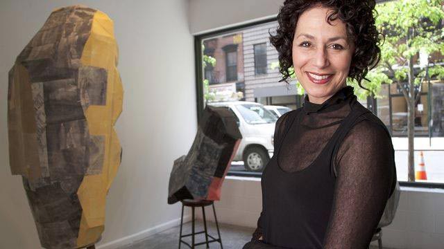
Sandra Firmin believes installation shots are important.
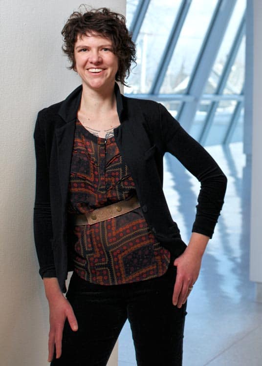
“A recent image should be the first thing I see when I enter the site,” says Lesley Heller of Lesley Heller Workspace in New York. “If I like it, I will click further and enter the site.” Firmin claims she’s against an “onslaught of imagery” as an introduction, and yet there are sites—like sculptor Millicent Young’s—with sizable thumbnails that lead fluidly into each series of works. “I don’t like it when the landing page has an animation you have to scroll through or can’t get out of,” adds Heller.
Dealer Lesley Heller wants to see recent work first and foremost.
The Images
Most say they like to see thumbnails that offer the option of clicking to pull up a larger shot, with caption information about the work. “Use the best images you can on your site,” advises Margaret Thatcher of Margaret Thatcher Projects in New York. “Installation shots are important and helpful,” says Firmin, “as are photos that show scale. Anything that helps visualize the work.” Amateur photography is frowned on, so unless you’re exceptionally skillful, hire a professional.
Many prefer to see the most recent work first, and caption information should be as complete as possible, and that includes a date, a title, dimensions, and medium. “Dimensions are critical if you’re trying to envision how a show will come together,” says David Rubin, an independent curator and writer in San Antonio, TX. And keep the images updated, says Firmin. “I’ve run into many artists whose last piece of info is from 2013.”
With more and more gizmos to look at, design is also a critical element. “Artists need to make their site accessible to look at on an iPad or a smart phone,” says Firmin. “A lot of sites are designed for iPhones. It’s part of the platform.” Fussy typefaces—notably those serif fonts that seem to have come from old newspapers or magazines—can be annoying. “Helvetica or Arial is much more contemporary,” Firmin believes. “If your site looks like it’s from another era, I’m not going to review the work.”
“Artists need to make their sites accessible to look at on an iPad or Smartphone.”
“On some sites I go looking for videos,” says Rubin. “But a pop-up tells me I need to use some plug-in I don’t have. It’s best to use familiar and up-to-date technology.”
Statements, CVs, and other Text
Curators tend to prefer a “written statement that’s short and sweet, without a lot of artspeak or jargon,” says Tricia Paik. “I tell artists that they should write their statement so it’s authentic and gets their ideas directly on to the page. Then have a talented writer friend read through it to edit it down or even revise it.”
Not sure what constitutes artspeak? A friendly website called artybollocks.com can offer some helpful hints and examples of unusually flagrant mash-ups of the obscure and the downright incomprehensible, like this one: “As intermittent derivatives become frozen through emergent and academic practice, the viewer is left with an insight into the edges of our world.” Or “With influences as diverse as Derrida and Miles Davis, new insights are distilled from both traditional and modern layers.”
Curators tend to prefer a written statement that’s short and sweet.
What’s lost when a statement comes across as obscure or hifalutin’ is the person behind the work. “Show your personality and be more conversational,” advises Firmin. “If you’re funny, try to be funny. If you’re earnest, that’s okay. In looking through a number of websites, I notice that artists are no longer talking about their influences or the things that interest them.” She recommends modeling statements after art blogs you enjoy reading; study enough of them and you may in time pick up those attributes called tone and voice—the sense of a real person communicating what’s important to his or her work.
CVs should be edited carefully too. If you’ve been in the business awhile, you don’t need to list every gallery show going back to 1973. But honors and fellowships are important at any age. Commissions also give a sense that you’ve passed muster with a jury, and that’s meaningful information to a dealer or a collector.
Other textual miscellany on a site includes contact information and lists of publications. “There should be direct links to articles written about the artist,” says Rubin. Or at the very least downloadable PDFs. “I’ve seen some examples where these are compressed into some kind of window and you have to keep scrolling down. The lesson here is easy access.”
When it comes to contact information, Rubin also prefers a direct email address rather than “one of those forms where there’s sometimes a limit to the number of words you can use.” And some, he adds, don’t even offer contact information, a nuisance when a curator prefers to get in touch directly with an artist, rather than sifting through the layers of personnel at a gallery.
Model Websites
I went cruising around a clutch of Vasari21 member websites to see what features I particularly liked and which annoyed me. Millicent Young has a couple of beguiling videos, one a 360-degree tour or her studio. It was delightful to see her no-frills workspace with windows looking out on the Virginia landscape, and the materials and tools of her calling carefully arranged throughout. Kate Petley offers a striking recent painting as the portal to her site, and an unfussy toolbar leads easily to thumbnails of work in different mediums, each with complete information about dimensions, dates, and titles. Michelle Cooke has a handsome, easy-to-navigate site, but the type is tiny and drops out against a gray ground, making it difficult to read. And I could run on about the good, the bad, and the inscrutable, but invariably I was disappointed by the bios and statements. As a long-time editor and writer, I suppose I wanted something snappier and more revealing. So I fashioned my own fictitious blurb (bear in mind that this may seem a bit over the top, but you’ll get the idea).
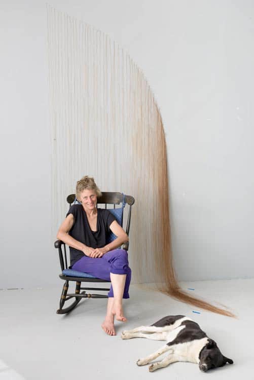
On her site, sculptor Millicent Young offers a 360-degree studio tour.
I started drawing when I was about four or five on the walls of my bedroom. Understandably annoyed with the scrawls in lipstick and crayon, my mother tacked up large sheets of butcher’s paper and I could scribble to my heart’s content. Later I started sketching out of doors, enraptured by the woodlands and fields that surrounded our rural home. A bit dyslexic, I knew I wasn’t headed for a liberal arts education, but a smart guidance counselor steered me toward the art curriculum at Brueghel University, which offered comprehensive academic training.
Later, in graduate school at Yale, I made a serious effort to expand my reach through geometric abstraction in color, but my adviser, Peter Halley, saw that my heart wasn’t in it and urged me to continue in black and white, adding erasure to my repertoire of gestures. The books that influenced me most deeply were during those years were Kandinsky’s Concerning the Spiritual in Art and the Collected Writings of Donald Judd.
Ten years and four sold-out shows later, I still consider myself a draftsperson, though I often use a brush and rags. I tend to feel the closest affinities with certain artists like Kenneth Noland and Sol Lewitt, who could pursue an idea until they had exhausted its possibilities, without losing the freshness of the original impulse. What I’m finding now is that the natural world is stealing back into my imagery, and there are hints of the tree trunks and grasses and plants that captivated me as a child. Oh, and I must be doing something right because I just won a MacArthur “genius” grant.
Here are some further tips from one of the greatest prose stylists of all time, George Orwell.
Ann Landi
Photo credits: Enter photo credits here.
Ann,
A great read and informative article. Much appreciated as I am in the process of rebuilding my antiquated website.
So thank you!
Ann Landi does it again offering another series of interviews jam packed with information. Thank you, Ann, and all those who shared their experience. If you don’t know about Vasari 21, read this recent article and listen to the interview with Tricia Paik.
Ann, thanks for the great suggestions for a good website. As a result of reading them I think I will try to incorporate a short video with a view of my studio and new work. I’ll also review my statement and bio., Niki
Glad to be of help, Niki!
Thank you for the info! Loved it.
Thank you for the website advice. It’s easy to allow one’s site to grow outdated. You’ve inspired me to keep it current and easy to navigate. Your mock “artist statement” was amusingly helpful.
Thank you for these comments. They were very helpful
Very helpful indeed Ann!
Very worthwhile info Ann!
Even more practical useable information- thank you so much for making this available!
Useful and practical advice from those who look at our work. Thank you, Ann.
Thanks so much for this. I am incorporating this information into my art marketing course.
Thanks so much for this, Ann. It’s such practical and refreshing advice.
thanks. Very informative
Thank you for refreshing my memory about these nuggets of gold. In addition to good advice that I will implement, it’s nice to affirm what I’ve done right!