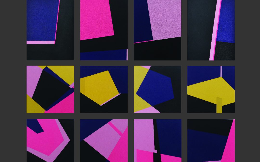
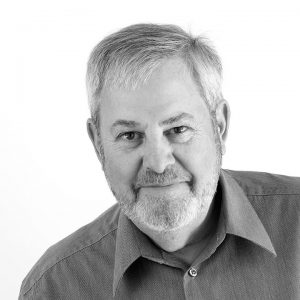
By the time he was twelve, Robert Parker had discovered his twin passions in life. Having read about Frank Lloyd Wright, Mies van der Rohe, and other master builders as a kid, he determined on architecture as a career. But he was drawn to the visual arts as well and remembers working in the Grand Tetons and Yellowstone as a teenager and stumbling across the watercolors of Thomas Moran, the painter who made the first color renderings of the area, works that would help establish Yellowstone as a national park in 1872. Both influences have proved enduring in his mature work, though the connection with Moran may at first appear obscure. “I still have those early watercolors inspired by him,” says Parker, “and the colors I used at that time are still favorites of mine.”
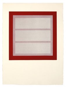
Shadow Castings Series 1-4 (2004), monoprint, 30 by 22.5 inches (printed by Jennifer Lynch of Lynch Pin Press).
While studying architecture at the University of Colorado in Boulder, Parker also discovered another formative influence: the color theories of Josef Albers and Johann Itten, as introduced to him by a designer and faculty member named Maurice Barr. “We did 10 to 15 nine-inch-square exercises per week. I didn’t realize how much this affected me until later, not so much for architecture as for art making.”
At the time he was an undergraduate, he was taking as many art courses as architecture requirements, yet he remembers it as an era in which “art and architecture were mutually exclusive. It wasn’t until the 1980s or ‘90s that color became important to architecture. That was not the norm when I was coming of age. We worked in very subtle, reductive colors.”
Since the university in Boulder was heavy on engineering, which meant courses in higher-level math and physics—none of which seemed really relevant to his ambitions—Parker took a year off to work for his father, who was a manufacturers’ representative for heating and plumbing supplies (a job that allowed him to call on many of the architects and engineers in Denver). He then completed his degree at the University of Minnesota and moved to Philadelphia to work for Louis Sauer, known for his innovations in low-rise, high-density housing and for advocating good design for those generally ignored by the mainstream. After four years, he decided to pursue a master’s degree at Massachusetts Institute of Technology, where he studied with photographer Minor White and helped with planning and housing projects in developing countries.
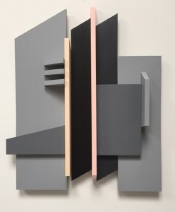
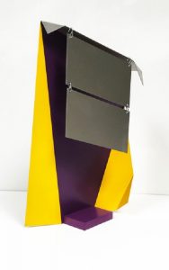
Fourth Stage for Performance Architecture (2017), mixed media, acrylic on wood, 22 by 20 inches, variable depth
A serious interest in environmental planning led to a job at the Nova Scotia College of Art and Design, where he helped found an environmental planning program, one of only six such programs in North America. “I said I would stay for a couple of years, and ended up spending 27 years in Nova Scotia,” he recalls. “I fell in love with the people and the landscape, and jumped at the chance to develop an environmentally based program.” After his second wife died in 1990, Parker maintained a private architectural practice and then joined firms with the woman who became his third wife, Deborah McLean, whom he’d known professionally for 15 years. “She brought skills I didn’t have. We did a lot of land-reclamation work for mining sites, main street and urban design projects, and a lot of community planning.”
Concurrent with his endeavors as an architect, Parker still pursued his interests as an artist and even taught life drawing at the college part-time. “I had my own studio the whole time I was there, and I was doing a kind of variant on Abstract Expressionism until I found myself leaning toward a more minimalist style, which has remained strong for the last 20 years,” he says. So much so that he’s made about nine trips to Marfa, TX, to see the galleries devoted to many of the high priests of that movement.
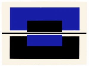
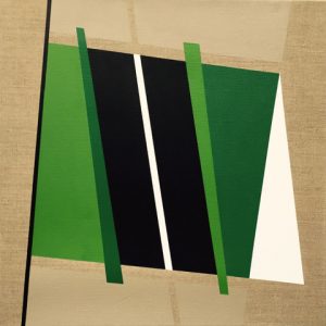
After relocating to Taos, NM, in 1997, his painting, he says, “moved quickly toward a very hard-edged geometric style.” He cites Donald Judd as a particular influence, but after meeting Agnes Martin he acknowledges a growing fascination with the grande dame of the grid, who spent her final years in this small mountain enclave. “Initially I did not get her art at all,” he says. “It looked like laundered pinstripe shirts to me.” Then, at an exhibition at the New Mexico Museum of Art, he encountered her works again and their power hit him full force. “I was in the show for more than an hour, and when I came out I was crying like a baby. I painted in somewhat of an Agnes style for perhaps eight years, and then after she died I realized it was time to put her aside. But she’s still a big influence in terms of composition. Her philosophy, and her approach, were both significant.”
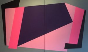
In the last decade or so, Parker has worked in a range of mediums—from photography to glass to printmaking to shaped wooden reliefs. “I’m not wedded to one particular style. I’ll follow a direction for two or three years, and then maybe the medium will shift.” At the Harwood Museum in Taos next month (August 1-26), visitors can get a look at his latest forays in a show called “The Zoot Suits Are All Gone.” It’s a series that allows him to combine a long-standing interest in hard-edge geometric abstraction with the jazzy colors of the zoot suits—the flamboyant high-waisted getups that were particularly popular among Latino and African-American men during the 1940s. “The Zoot Suits gave me permission to explore colors I’d wanted to work with for years, like purple, yellow, and especially pink,” he says. “All of the new work dates from January, and I don’t know where it’s going from here. Like Gerhard Richter, I don’t want to be hemmed in by one particular style or approach.”
Ann Landi
Top: All The Zoot Suits Are Gone (2018), acrylic with sandpaper on canvas, 12-panel suite of paintings, 52.5 by 50 inches
