Josef Albers: Beyond Light and Shade
By Mitchell JohnsonMost of Josef Albers’s paintings are very unusual and far more complex than they initially appear; they are not about Op art, color theory, or Minimalism. They are about paying attention. Just as his famous book on color theory, The Interaction of Color, is vast and dense, almost unapproachable, a true appreciation of the “Homage to the Square” paintings is equally as hard won. Just as Albers is famous for having encouraged his students to work with colors they didn’t like, his “Homages” are scenes of color theater that are not at once attractive or pretty. Albers is establishing new territory for beauty; he is claiming more for painting than light and shade.
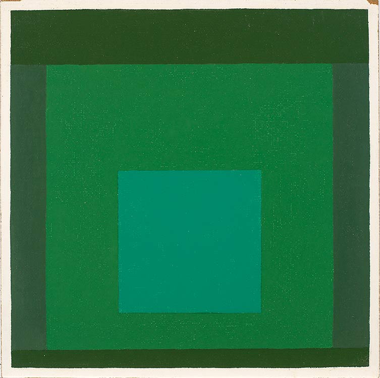
Josef Albers, Homage to the Square, n.d., oil on Masonite, 16 by 16 inches
Sure there are references to nature in some of Albers’s work. When I was an artist in residence at the Albers Foundation in Connecticut in 2007, I would go running through the woods and would began to feel that a “Homage” might reside in anything—from asphalt to leaf to concrete to earth. You can see the colors nested in your mind’s eye, and I was convinced I was on to something. And yes, the “Homages” have everything to do with observation and life. But when we look at the odd muddy grays and browns that are unexpectedly allied with pink or deep reds or dull greens in a “Homage,” Albers is inviting us to seriously focus on color combinations most of us have never noticed or considered, and that we may not find on a hike or in a fabric store. By being so literal, I was selling the experience of a “Homage” short.
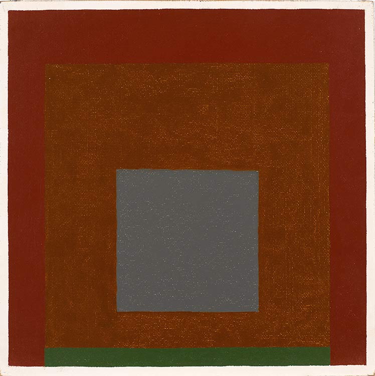
Josef Albers, Homage to the Square, 1962, oil on Masonite, 16 by 16 inches.
Don’t be confused by the format of the “Homages,” the arrangement of the nested squares is not a commentary on style, and it certainly isn’t intended to distract from the joy, drama, and mystery in each painting. Think of the format as a stage and color as a metaphor for people. Albers liked to say that his ubiquitous “Homage to the Square” paintings “look at you.” Consider that a “Homage” is a group of three or four colors that did or did not pass muster in Albers’ Connecticut basement under his fluorescent lights. When Albers assembled the right group of colors, he felt the painting looking at him and this was one of his criteria. I think he meant the painting is looking at you, watching you as much as you are considering it, in the sense that the painting, like a person, might wonder, “Are you paying attention, are you in the moment?” Albers, perhaps more than any of us, knew that we are limited by our prejudices and that we are creatures of context. The goal of his teaching, his art, his commentary, was not unlike the goals of Zen—both to make us more aware of context, and to make us realize the extent to which we are participants in all of our perceptions.
Albers’s paintings and his intense statements about color theory, teaching, and perception are just as likely to frustrate and polarize as they are to intrigue and convince. Tom Wolfe demonizes Albers as an enemy of creativity and talent in From Bauhaus to Our House (1981). Wolfe claims incorrectly that the goal of Albers’s color course at Yale was to help students “create works of art.” In fact Albers stated very clearly in his handbook on the subject, The Interaction of Color, that the course is an experimental approach to teaching color and the only goal was “to open eyes.” Donald Judd gave The Interaction of Color a mixed review when it first appeared in 1963, and although Judd and Albers are frequently aligned in the art world, Albers is all about “hand crafted,” a quality Judd disdained. Jeannette Redensek, a researcher at the Josef and Anni Albers Foundation in Connecticut, included the Albers quote about how “the painting looks at you” in her wonderful essay from the recent exhibition “Minimal Means, Maximum Effect” at the Fundación Juan March in Madrid. Redensek articulates the dangers of trying to understand paintings and artists through reproduction and through the Internet. Her observations about Albers’s tubes of color, palette knives, and working methods emphasize the importance of Albers’s physical, hand-made surfaces. She reminds us that Albers’s paintings are intended to communicate “his generous and democratic conception of art.”
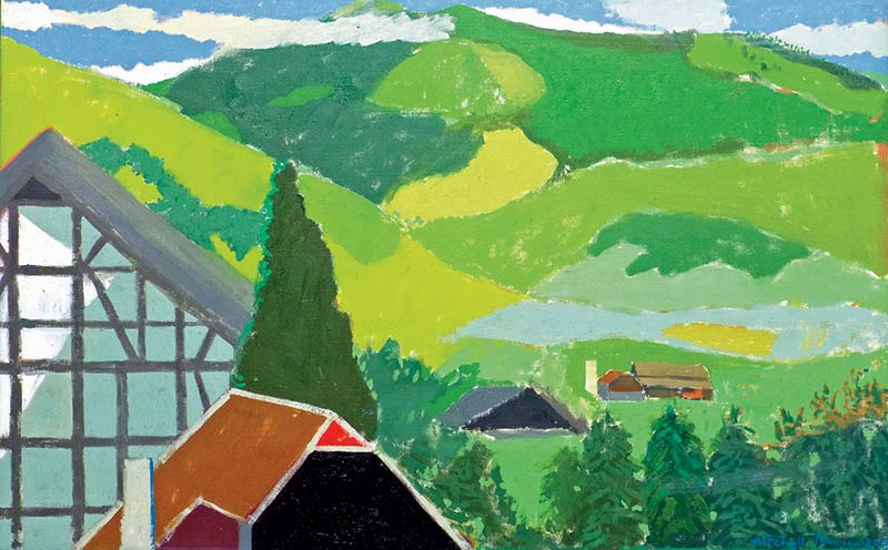
Mitchell Johnson: Rossiniere, 2014, oil on linen, 24 by 38 inches
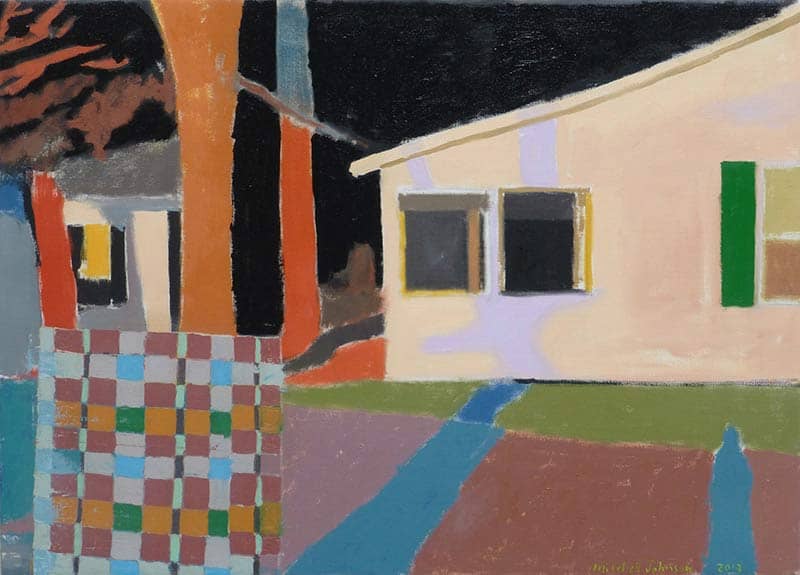
Mitchell Johnson: Ogunquit (Stieglitz), 2013, oil on linen, 18 by 30 inches
 Mitchell Johnson, who is based in Silicon Valley, has moved seamlessly between abstraction and representation for more than 30 years. His paintings are in more than 700 collections, and his works have been featured in ARTnews, Artforum, and Art in America.
Josef Albers image credits: ©2015 The Josef and Anni Albers Foundation, Artists Rights Society (ARS), New York .